[Weekly Screenshot] Art of Balance Wii U #2 – Marvelous Menu Screens
Posted on April 22, 2014 by Brian(@NE_Brian) in Screenshots, Weekly Screenshot, Wii U eShop
Hey all, it’s Brian and Austin from Nintendo Everything here to re-welcome Manfred from Shin’en back with yet another screenshot from the upcoming Wii U release of Art of Balance! He’s got plenty to say about what graphical details they’re implementing for the menus in the game, so revel in the relaxing room where you select your levels and read up about how it came to be below! Unless you’d rather simply revel at the picture. That’s okay too.
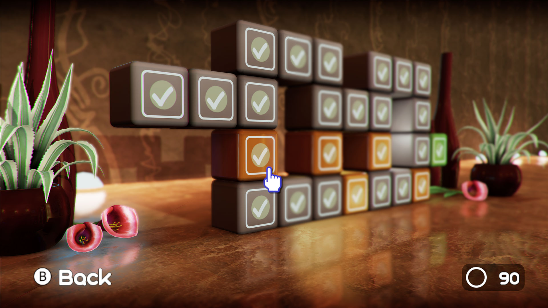
Hi guys, it’s Manfred from Shin’en again with another fresh shot from Art of Balance Wii U. This time we’ll show you one of the the level selection screens.
When developing the original game on Wii, we realized that a simple 2D grid would be good enough for a level select menu, but that in itself was too boring. So we came up with the idea of stacked boxes in a lush 3D environment. We think coming back to the this beautiful menu gives players a nice break after solving a level. On Wii U, we had tons of performance to waste on this screen so we implemented quite a number of effects.
First of all, it’s the great texture work and art style from Martin [Sauter (Shin’en art director)] that makes this screen shine.
To get more gloss we add reflections on the marble; we simply love that look, and the reflections are physically based, depending on the roughness of the marble. To make the overall shading more natural, we use image-based lighting for the ambient term. This gives off a very soft appearance.
Then we add a ‘depth of field’ effect around the player’s cursor. So everything you point to will be in focus while objects that are farther away will get out of focus.
To render the plants and flowers, we use a custom screen space subsurface scattering shader. It’s not perfect, but it’s much nicer then our default physical-based shading which doesn’t allow light to bleed through surfaces.
To ‘ground’ the boxes we use ambient occlusion. A front light adds dynamic soft shadows. If you look closely you can even see the shadows becoming less visible near the back light sources.
To give everything a more ‘cinematic’ look, we render again in high dynamic range and apply a classical ‘S’ shaped tone mapping curve. We also add a little chromatic abbreviation and a small vignette effect as finishing touch.
That’s all for today. Best from Shin’en!