Astral Chain UI artists shares details on the game’s user interface development
Posted on August 19, 2019 by Devin(@Sonicb00m111) in News, Switch

As part of the ongoing series of devblogs being put out by Platinumgames in the lead up to the release of Astral Chain, the blog has taken a new look at the team’s development of the overall user interface of the game.
This time around, we get to hear from lead UI artist Rui Onishi and other UI artist Yasutaka Saito. Those interested can read the notes below, and visit the blog to view animations of the development.
Hello, everyone! I’m Rui Onishi, lead UI artist for ASTRAL CHAIN. Writing these devblogs to share part of the development process with all of you is a fun part of releasing a new game, and now I’m happy to give you an inside look into the creation of ASTRAL CHAIN’s user interface. There’s a lot to cover, though, so I’m not going into this alone!
Three other user interface artists helped me out in making various parts of ASTRAL CHAIN’s UI, and I’ve asked each of them to write a bit about their work! With so many people contributing, we’ve had to split this devblog into two parts. I’d like to start things off with some background information about what a UI artist does, and the design concept for ASTRAL CHAIN’s interface.
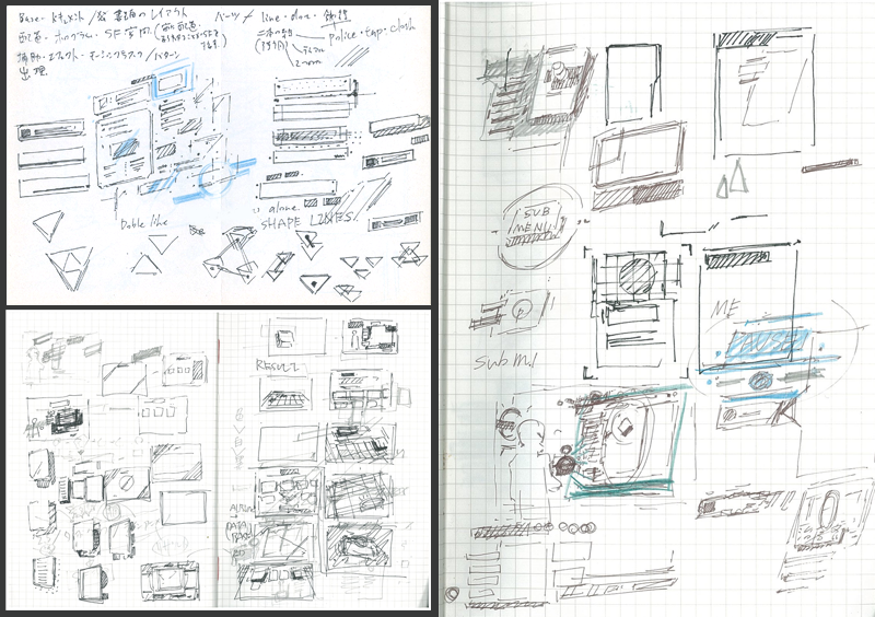
What a UI Artist Does UI artists design and create the game’s user interface: lock-on cursors, health bars, dialogue boxes, map screens, title menus, weapon and item icons, so on and so forth. On top of designing and making all these UI elements themselves, we also create animations for them, so that they react properly as they appear, disappear and respond to user interaction. Just one page from my notebook of design sketches. Does anything look familiar?
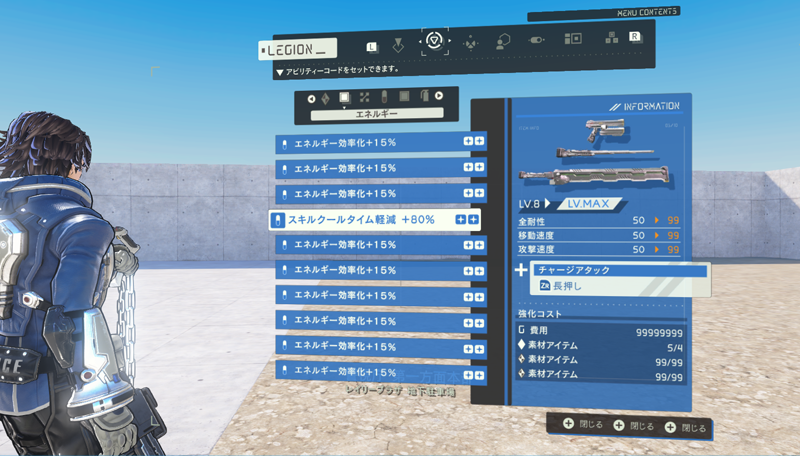
ASTRAL CHAIN UI Design Concept A game’s user interface needs an overall design concept, just like characters and environmental art do! The main defining characteristic of ASTRAL CHAIN’s setting is that it’s a technologically advanced near future, with plenty of information and detail shown through holograms. This screenshot from our development environment shows the Legatus Menu, when it was still a work in progress.
I took on the mantle of lead UI designer right as the development team was focused on strengthening that setting. Thus I had a goal as I designed the UI: Make it look and feel like a hologram projected in physical space, as if it were something the main character uses themselves, not just the player’s way to interact with the game from outside.
The UI that was already implemented at the time had a flat design and an orderly layout. Its planar layout and simplicity made it look a bit like futuristic paperwork from some government office or police department.
After a bit of thought, I decided that the existing flatness and official “paperwork” motif was appropriate for ASTRAL CHAIN’s setting. Not to mention there’s a lot of information that needs to be shown onscreen in ASTRAL CHAIN; the simplicity of the existing design suited that very well. So we would be keeping that general idea.
I took the existing UI and tried showing it from different angles. I offset some of the meticulously-ordered windows to make it look as if they were subtly tilting into the background. Little touches like this made the UI look more like it was projected into space in front of the player character.Then it was time to adjust and animate. I gave the UI high-contrast color schemes to fit in with the overall graphical tone of the backgrounds and Legions. The UI animations are smooth and use sharp lines and digital noise to add to the sci-fi feel.
There are countless other details about the game that informed the UI design. For example, though the cityscapes of the Ark are brimming with color, as a police unit, Neuron’s HUD elements are serious and subtle. Since the game is set in a near future, Neuron’s holograms often play a role that physical paperwork plays in our world; this creates a bit of cognitive dissonance that we emphasized to interesting effect. And most of Neuron’s officers, including the player characters, are young people, so a balance between the official, formal aesthetic and a more pop anime sensibility was essential.
I finally arrived at two main pillars for the UI design that take all of this into account:
- A high-contrast simplicity that evokes official documents
- A sleek, futuristic hologram look
I put a lot of emphasis on making the UI animations as smooth and sleek as possible so that they’d fit in with the movements of the player character and their Legion. These pillars informed not only my own UI work, but also all the efforts I oversaw from the UI artists on my team. Believe me, I could gladly keep gushing about my personal thought processes behind ASTRAL CHAIN’s UI design, but I’ve gone on long enough already. I think it’s time to hand the reins over to my teammates!
Hi, I’m UI artist Yasutaka Saito. For ASTRAL CHAIN, most of my work focused on the graphics on all the monitors in the game, as well as UI animations. I’ve only been with PlatinumGames for about a year, and was lucky to work on ASTRAL CHAIN for half of that year! In my part of today’s devblog, I’d like to tell you about the animations I made for the title logo and Legatus menu. Let’s get started!
Title in Motion When I got my hands on the title screen logo for ASTRAL CHAIN, we already had a rough animation sketch. It was up to me to polish it up according to the director’s specifications. And those specifications were:
- Don’t make it take too long.
- Make it easy to tell when the full logo is completely displayed.
A lot of the UI animations in ASTRAL CHAIN use a blocky noise effect, and I decided to match the title animation to those by having digital noise come together to form the logo. Then I threw in a bit of chromatic aberration, some flashier noise and a shaking effect at the very moment the logo was fully displayed to make sure it got attention. Here’s the completed animation:
I made this animation in a program called After Effects, but to be honest, I didn’t use any effects that were particularly unique to that software. Just some creative masking.
It’s something of a “retro” way to animate things, but I prepared several dozen individual frames like the ones you see here. When they’re all put together, they form the shape of the complete ASTRAL CHAIN logo. Finally, I have the logo come together like these random parts are slamming together from both sides. I’m pretty sure I drew more rectangles on the day I made this logo animation than I have in the whole rest of my life…
Legatus Menu Animation Every Legion user keeps a device called a Legatus on their left arm. The Legatus is what allows them to control their Legion, but that’s not all – it also allows them to access the all-important Legatus Menu! (That’s the pause menu to you playing along at home.) When you pull up the Legatus Menu, it’s projected into space in front of you, and those projection effects mean animation.Once you open and start navigating the Legatus Menu, it unfolds and becomes the main focus on the screen. A bit of scattered noise here and there makes it feel dynamic, like a projected hologram, without diverting precious attention away from the menu itself.
Once the menu is open, noise sweeps through it with a “sandstorm” effect. It’s a little old-fashioned, but it makes it clear that you’re looking at a projected image. I knew that if this effect was too pronounced, it would make the menu look inappropriately retro; I tried a ton of color and tone combinations until I arrived at a subtle enough effect.
It may be a little hard to tell what I’m talking about from these video clips alone. In that case, you’ll just have to play ASTRAL CHAIN and see for yourself!