Ken Sugimori on balancing Pokemon designs
Posted on July 27, 2018 by Brian(@NE_Brian) in General Nintendo, News
![]()
![]()
Ken Sugimori has been working on the Pokemon series since the very beginning. In the Pokemon Ultra Sun & Ultra Moon Essential Setting Information book that came out in Japan at the very end of last year, Sugimori spoke about how he goes about balancing designs when finishing up Pokemon. According to Sugimori, he may “try adding something uncool to a Pokemon that is too cool, or I might add something cheerful to a Pokemon that is too serious.”
Siliconera provides the following translation:
Ken Sugimori, Pokemon series designer: The technique I often use when finishing up designs for Pokemon is to “keep the balance.” I might try adding something uncool to a Pokemon that is too cool, or I might add something cheerful to a Pokemon that is too serious. I spoke about making friendly designs earlier, but what I actually do is take something cool and make it less cool. [laughs]
Huh? But Lucario and Luxray look very cool.
Ken Sugimori: But if you were to make Luxray’s head smaller and eyes sharper, it would look cooler. “Making it cooler” is an adjustment I wouldn’t dare to do.
That is certainly a unique sensitivity of yours, Sugimori-san.
Ken Sugimori: I often tell members in charge of design to “take away from designs that are too cool,” but that is probably a sentiment that is difficult to grasp. What’s cool and what’s not is all subjective in the end. To put it extremely, my job is to get something that would look cooler if it didn’t have this or that on it, then put it in on purpose. [laughs] Basically, if it looks too cool then it takes away from what makes it memorable for the players.
So you’re saying that it becomes kind of like a pretty landscape painting.
Ken Sugimori: Exactly. It simply ends at “that’s cool.” After all, as Pokemon that are being sent out to the world, we want them to always remain memorable; however, I feel that in order to do so you have to add a touch to it. For example, look at Oshawott’s cheeks. It has three freckles, and if you take them away Oshawott becomes cuter. However, taking them away makes its face less memorable. Actually, a lot of people told me “I want you to get rid of the freckles,” but I strongly insisted “It is better to have them.” Going by my standards, this is the correct way to design Pokemon.
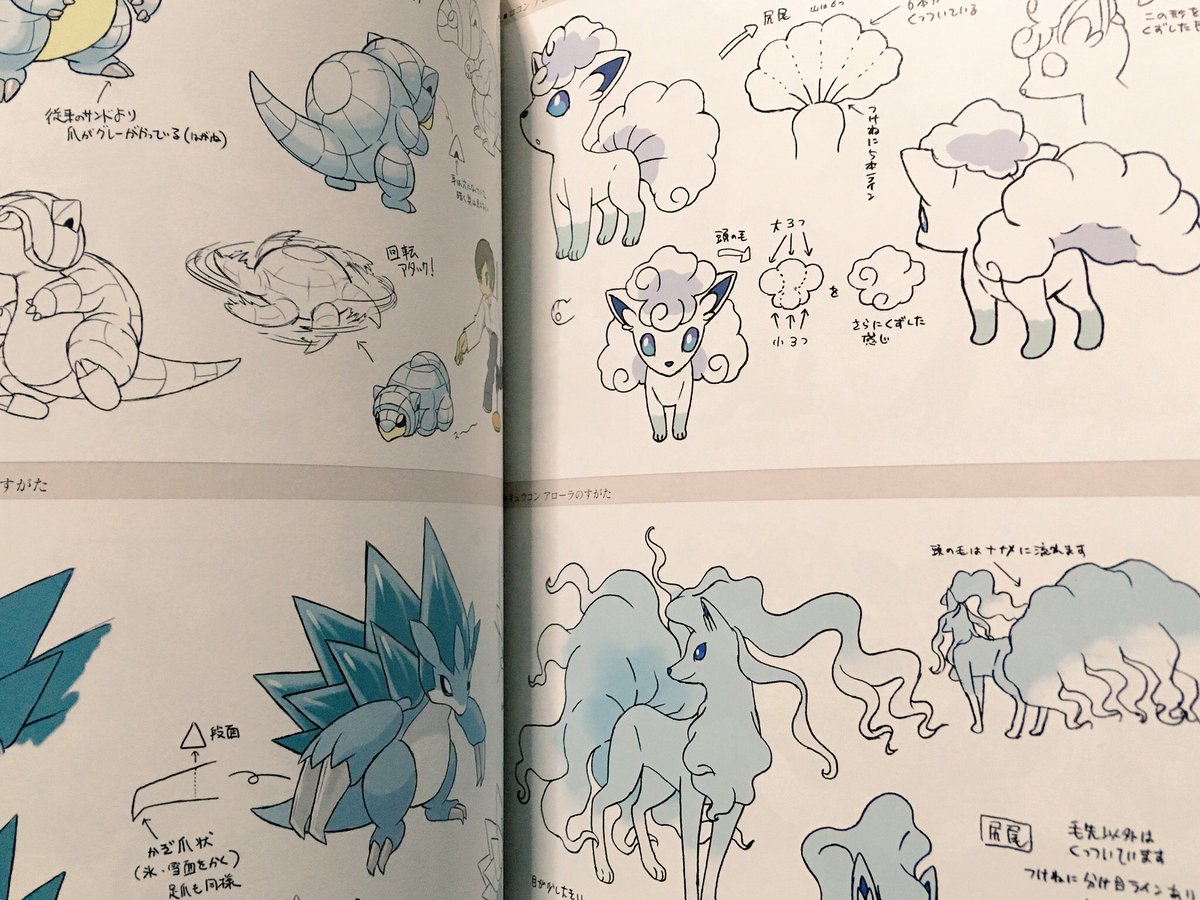
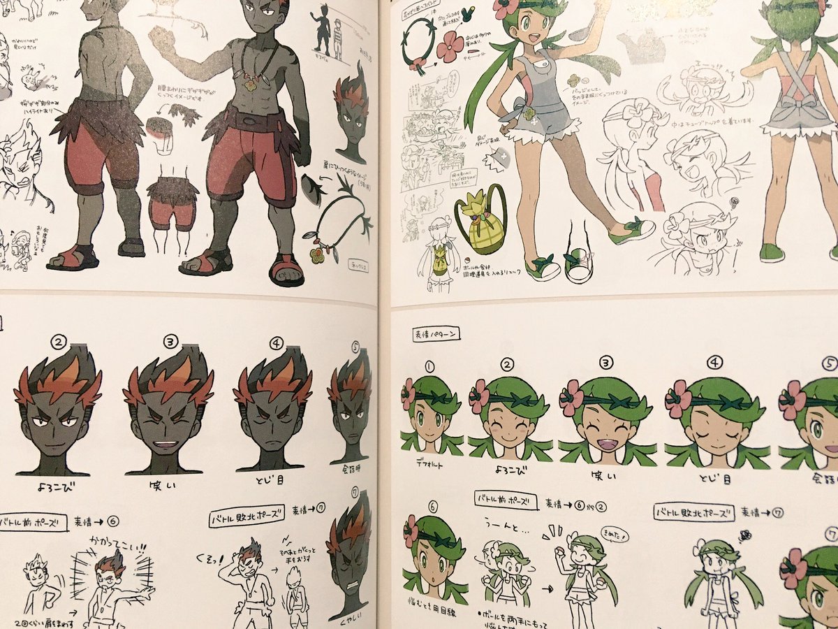
Below are some designs from the book: