Nintendo talks about Switch’s OS – home menu design resources have less than 200KB
Posted on August 22, 2018 by Brian(@NE_Brian) in News, Switch
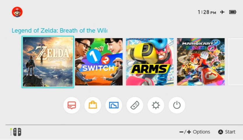
At CEDEC 2018 earlier today, Nintendo held a session about the making of Switch’s interface. Developers spoke about their approach for the OS’s creation.
The Wall Street Journal reporter Takashi Mochizuki was in attendance, and passed along some of the details that were shared. Here’s the full roundup:
– Nintendo decided to make Switch OS simple – feature game contents as much as possible
– Goal was easy to use & light to use
– OS has many features, Nintendo wanted people to feel it “looks” easy to use
– 1. separated games vs non-games; 2. adjusted sizes, colors and density; 3. top-to-bottom approach; 4. tried to make screen less crowded as much as possible; this was all to keep things in tiny and in order
– When designing button layouts, Nintendo tried a way that many people would agree in expecting how it would move next (like cursor); put buttons in just one row; use grids etc.
– Sound effects are also carefully coupled with texts and what’s on the screen so that it’s easy to understand what’s happening (hope this makes sense)
– In making Switch OS light, one ideal form was NES, which, you would only need to turn power on to play games; was so fast to launch
– Nintendo says using OS is like driving; first players understand what’s on screen, take action, then wait for result
– In cutting player’s wait time as much as possible, Switch’s home menu design resources have less than 200KB
– Nintendo made length of animation as short as possible, while keeping certain actions to help user navigate menu
– Cut the number of actions player need to take to reach outcome; default cursor on YES, instead of NO, when confirming exiting games
– Nintendo trusted players in telling OS what they want; no need to ask “are you sure” too much
– Text is sometimes better than icons; didn’t want to use icons that players have no idea what’s that about, which, they would check text anyway and as a result eyes move busy
– Before you put in “comfortable,” make sure you cut “uncomfortable” which would jeopardize any to-comfort efforts. Also, just “not-uncomfortable” isn’t enough if you are talking about amusement devices
– Nintendo talked about sound effects on home menu; it’s like animation of sound effects
– Examples include different effect for each line; adjusted rhythm and tempo; call-n’-response
– Switch has no OS BGM as it focuses on quick access to game contents