Super Mario Odyssey boxart swaps out Mario in his sombrero for a swimming scene
Nintendo sent out the boxart for Super Mario Odyssey during E3 in June. Since then, the packaging image has been updated.
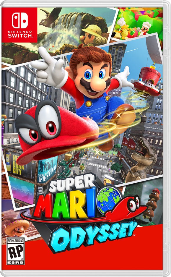
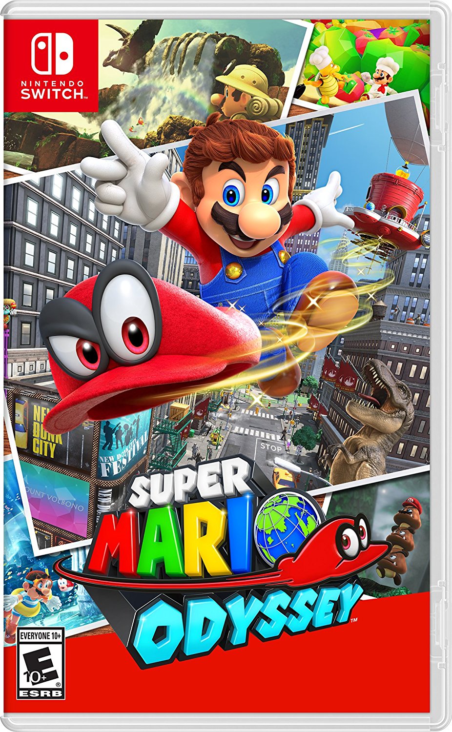
The boxart is still very similar to what was released originally. Nintendo has made just one change to the scene in the lower left-hand corner. It previously depicted Mario in his sombrero, but now has him swimming with a snorkel and an inner tube.
This was the original boxart:

And the updated version:
The change was likely just a design choice in the end, so it may not be worth reading into things beyond that. With that in mind, which one do you prefer?
More: Super Mario Odyssey
Leave a Reply

