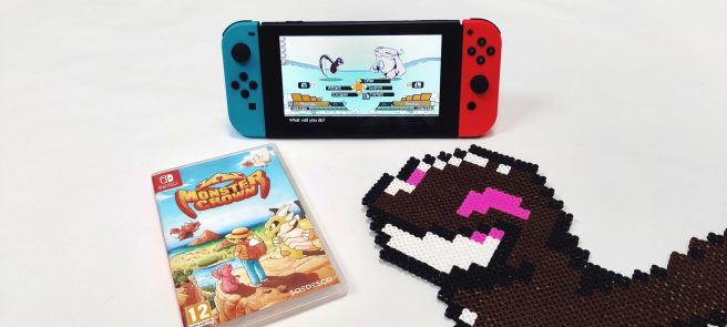
Monster Crown update out now on Switch (version 1.0.3), patch notes
A big 1.0.3 update has gone live for Monster Crown on Switch. It comes with a bunch of adjustments, technical improvements, bug fixes, and more.
Below are the full patch notes for the Monster Crown version 1.0.3 update:
- Party screen move reordering added
- Mirror Challenge floor count added, and challenge reduced to 50 floors
- Wild Troves now use Boss tame style, HP is more significant than level when they consider pacts
- Demon pact-only monsters now tameable in Card Dungeons
- Lost temple exit warp adjustment
- ZebraCoati added to Lost Province
- Online trading monster-select issue fixed
- Random Tamers now fade out after defeat
- Crossroad cutscene tweaks/polish
- Rodney (Frobec Chief) no longer re-fightable
- Additional sound effects added to various menus for a more responsive feeling
- RAM usage reduced to about half (a little less than half)
- Open world level rebalancing
- Random encounters have a slightly lower chance of being ones that chase you
- Charity Chief given a new team
- Chiefs now have identifiable shields above them on the overworld for easy identification
- Monster ability icons now show descriptions for greater clarity
- Improved Net Egg functionality (easier to grab a new egg)
- Issue with wild eggs fixed
- Random encounters can now be having a snack of berry or meat
- BULLDOZER MODE (you can now decimate enemies like scouting while riding your monster, it’s kinda too much fun tbh)
- Attack animations sizing adjusted
- Issue affecting box operations in the fusion menu fixed
- Can now ride Epheal FB
- Skill uncap option added (Check your settings)
- No longer enter a weird state when Raptor-flying while surfing
- Syleendra bug fixed
- Can no longer use Monster Moniker early, added UI indicator for it and it’s now easy to remove using the wardrobe
- Thallox added to Greed’s castle
- Mathen now available, the way she was always meant to be!
- More gradual day/night cycle, might become even more gradual and slow if no one has any performance issues with it
- Party scrolling now loops around (good suggestion I received on Reddit!)
Screen ResolutionProbably the first thing you’ll notice is the resolution change in game, the width and height of the camera has been increased by a little over two tiles each. While this can seem like a small change it actually makes quite a difference, especially on larger displays. You can see more of the game world and the detail level on large displays is just so much of a better fit. It also means you see more of the pixel art at the “distance” it should be.
UI Overhaul
All over the game you’ll notice the new increase in resolution has not gone to waste! But before we get into that, the main menu usability has been worked on quite significantly. When you open the main overworld menu you’ll notice it’s now a bar over on the left, and it automatically opens the party screen. You’ll be able to scroll up and down to select menu options faster, enter and leave the submenus and responsiveness has been increased here.
Shop and Inventory ScreensThe Shop and Inventory screens have been revamped to show more items in a more modern looking interface. You’ll be able to see all items available in the shop in an instant and my hope is that this will bring more attention to Ultra Rare Berries, a quick super-level-up method that many aren’t aware of!
Farm Box
The Farm Box screen has been changed to show your party at all times, as well as showing all stat and move info of your monster as you scroll over them, reducing the need to enter a subscreen to check them out in full detail. This makes it easier to use the box and there’s even some more screen real-estate on bottom to spare. This will be used for some sorting or quick use features in the future, to make the box system even easier to use and find your favorite monsters.
Finding Items
From now on when you get items rather than an intrusive box displaying on screen that slows you down, an item queue will appear seamlessly to the left of the screen showing the items you recently found. It’s faster, seamless, and still easy to recognize what you just received!
Stat Buff/Debuff Feed
You’ll notice that now when a monster receives a buff of debuff it scolls across the bottom of the screen. It’s there longer, so you can read it without missing it with the old side-of-monster display, and it doesn’t interrupt your flow. In time I imagine we’ll get rid of the old display entirely.
All players can download the new Monster Crown version 1.0.3 update now.
