[NintendoEverything Book Review] The Legend of Zelda: Hyrule Historia
Author: Patrick
Full disclosure: I’m probably the only writer for Nintendo Everything who doesn’t really consider myself a fan of the Zelda series. My opinion of every Zelda game tends to dramatically vary, but I think the series’ art is the one area that the games consistently excel at. And so when it was announced that Dark Horse would be publishing a combination of art and history book to celebrate the Zelda series, of course I jumped at the chance to review it. The Legend of Zelda: Hyrule Historia sure makes a great first impression. Even the regular edition Hyrule Historia has a hardcover and with over 250 pages it’s quite a heavy book. It promises plenty of fully translated information about the series from the specifics of the Zelda timeline to the shape and density of Tingle’s chest hair, but we won’t really know until we take a look inside…
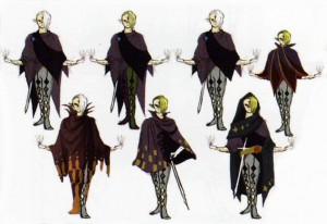
Did you like Skyward Sword? Well Hyrule Historia sure hopes you did, since it starts off with almost 70 pages of Skyward Sword art. As with most art books, I found the most interesting parts to be the rejected designs and seeing how the concept art evolved into the final product. There are plenty of alternate designs for characters like Ghirahim and Fi, not to mention characters that never even made it into the game. If you thought the shopkeepers in Skyloft’s Bazaar look a bit odd, just wait until you see the rather homoerotic potion shop owners who bathe in their own concoctions. Comments from the development staff point out some interesting details I never noticed, such as the overall motif of “time” that goes with Impa’s design (but no-one ever tries to explain the awfully out of place design for Tentalus). It’s not all character art, though, there’s plenty of artwork of the game’s gorgeous landscapes and even a couple of mechanical designs for things like Timeshift Stones. If you didn’t like Skyward Sword then chances are you won’t appreciate it being the focus here, but since it has arguably the most interesting art direction in the series it’s not a bad way to start off the book.
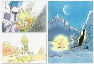
One of the main selling points of Hyrule Historia was the promise of finally figuring out when all the Zelda games take place in relation to each other. The whole timeline is set out at the beginning of the second section, with the next 60-odd pages containing a comprehensive (and tedious) recount on the events of every Zelda game. Given the similar narrative structure of most of the games in the series, I found the summaries got a bit repetitive. Strangely there’s a bunch of concept art and extra details hidden away in this section that aren’t repeated anywhere else in the book like translations for the Hyrule and Gerudo languages from Ocarina of Time. Personally I would’ve preferred if this whole section was just replaced with more art, but I can see how those who obsess over different timeline theories could find it interesting. And if for whatever reason you bought the book without having played a single Zelda game, it should get you up to speed pretty quickly.
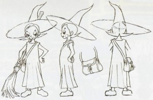
The book’s third section is easily my favourite, since it’s devoted entirely to exploring the art of every Zelda game that isn’t Skyward Sword (or some weird spin-off like the CD-i games). Most of the art should look pretty familiar, but there are a bunch of neat pieces that show how the series could’ve gone in a completely different direction, like a proposed “sci-fi” themed outfit for Zelda. While there is plenty of space given to the original Legend of Zelda’s concept art, there isn’t a whole lot of content for most of the older Zelda titles. Maybe all the art was just used up in the timeline section, but there are more pages devoted to covering different models of trains in Spirit Tracks than Zelda II, A Link to the Past and Link’s Awakening combined (to be fair, the rejected Tingle Train concept is hilarious). There also isn’t a whole lot of environmental art. There was a fair bit of it in the Skyward Sword section, but the retrospective seems to be more focused on character designs.
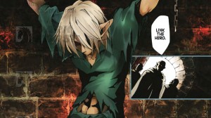
Rounding out the package is a short comic by the duo known as Akira Himekawa, who have been creating comics based on the Zelda series since 1999. I haven’t read many of the entries in their Zelda manga series, but I do like the way that they expand on the games’ basic story, even if it means adding things like Link actually having a personality. This particular comic serves as a precursor to Skyward Sword, telling the story of how Skyloft rose into the sky and featuring the very first incarnation of Link. It’s an interesting premise, but it isn’t considered part of the Zelda canon so it feels a bit out of place in a book that is otherwise all about explaining the history of the series. Also unlike the rest of the book, most of the manga isn’t presented in colour, which is disappointing.
Well he does.
–
Want to participate in more NintendoEverything goodness?
Try our Facebook page!
Or our Twitter page!