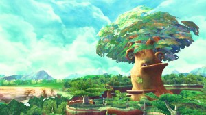
Aonuma elaborates on Skyward Sword’s art style
This information comes from the Official Nintendo Magazine…
“One of the reasons we’ve chosen the art style we have with Skyward Sword is that it is a better vehicle to showcase the exaggerated characteristics of some of the characters. Not only of the enemy characters, but as a representation of the sword spirit itself. Because of the way we have put the game together you have to focus on how the enemy is carrying their weapon, and there are a couple of different ways you can go about that. One, you can be super-realistic, and the other, not so realistic. We thought that because we want to highlight the swordfighting combat, we have to exaggerate the features. We thought that the art style we chose was best-suited to do that. You have to match the art style to how the game plays, and we thought this worked best. We matched the artwork so that we can highlight the over-exaggeration in the gameplay.” – Eiji Aonuma
At first, I wasn’t really sure what to make of Skyward Sword’s art style. However, I’ve warmed up to it quite a bit since the title was announced. One reason for that is due to the image above – It looks very nice, don’t you think?
