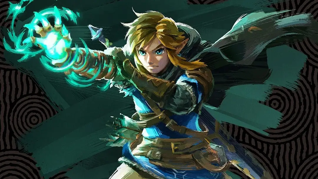
Zelda: Breath of the Wild and Tears of the Kingdom dev on approach to loading screens, wanted players to feel ‘happiness’ when cooking
In a recruitment post on Nintendo’s website, developer Daigo Shimizu spoke about what it was like working on the UI for The Legend of Zelda: Breath of the and Tears of the Kingdom.
Shimizu spoke about how starting with Breath of the Wild, the team opted for “a more streamlined approach.” That means removing clutter and focusing on what was truly necessary. If you’ve played either Nintendo Switch title, you may have noticed that there isn’t a ton happening on screen aside from the actual game world.
The idea of practicality and ‘happiness’ was something brought up for the loading screens. Breath of the Wild featured tips, but Tears of the Kingdom showed the map to get players excited about exploration. Along the same lines, the theme of ‘happiness’ was used for cooking and specifically the Recipe Book in Tears of the Kingdom as the team felt “people feel happy by looking at restaurant menus or pictures of food”.
Below is our full translation of the piece:
UI allowing for deeper immersion
The job of a UI/UX designer is designing the contact point between the game and the player. Designing that contact doesn’t just require understanding the game world, but also an understanding of the player’s feelings in normal life and their psychology. At Nintendo we value designs that naturally draw out the player’s sense of curiosity and anticipation, in order to deliver charm, fun, and excitement.
As A UI/UX designer one title I worked on was The Legend of Zelda: Breath of the Wild, which was released alongside Nintendo Switch. That game was developed with the concept of ‘rethinking the conventions of Zelda’ as a base, and the UI was thought of as ‘a UI that would be better if it wasn’t there’, moving away from a decorative look and creating a more streamlined approach. After that, for the sequel Tears of the Kingdom, we thought about taking the existence of the UI to the absolute minimum, but rather than making something bland, we made something that worked with the player’s feelings, and aimed for ‘an experience that allows deeper immersion into the world of Zelda.’
‘Excitement’ from the map
Both titles shared a large world that had loading times when Link warped during his adventures, in order to load the new terrain. In Breath of the Wild, during the loading time, tips that would be useful during your adventure were displayed on the screen to make that time into something more practical. During the development of the sequel, Tears of the Kingdom, we thought about how to bring out the freshness, and if there was something we could do to ‘allow greater immersion’. After consideration, we realized the thing we needed was the ‘happy experiences’ that we feel in everyday life.
We thought many people had experienced the excitement of opening-wide a map in order to plan out a vacation. Personally, I love opening a map and thinking about where I should go and explore next weekend. I thought, “Isn’t there a way to bring that exciting experience into the load screen?” and so designed it to display the map around where you would be warping to. So the loading time went from simply ‘waiting time’ to ‘preparing for your next adventure time’. I think it allows that feeling of ‘the fun of exploration’ to be felt outside of normal gameplay, and allows you to notice landmarks and places you want to detour to and discover.
‘Happiness’ from looking at cooking
In this way we designed the UI/UX by layering subtle ideas based on everyday experiences and psychology to allow lots of players to feel ‘excitement’ and ‘happiness’. Such considerations weren’t just about the map, but also, for example, the everyday ‘happiness’ felt while cooking.
I think lots of people feel happy by looking at restaurant menus or pictures of food on social networking services. We actually created many icons for food in the game, but the pouch has a limited size, so it wasn’t possible to stockpile them. Since we had such a variety of types of recipes, we thought it would bring feelings of ‘happiness’ by looking at so much delicious food. Furthermore, we thought the feeling of ‘I want to look at food I don’t know’, would lead to curiosity and creating lots of different recipes, which would increase the happy experiences for the player. Thinking about that we created the Recipe Book.
These were just a few examples, but we put many things into the game to create ‘excitement’ and ‘happiness’. UI/UX design may look difficult, but at Nintendo, this kind of design values the positive experiences in our daily lives. Via trial and error we attempt to make our designs practical and appealing by considering ‘If I did this, would it be more fun?’ The true charm of being a UI/UX designer at Nintendo is that we’re not creating tools, but entertainment products. I feel that a huge appeal of this work is delivering even just a little ‘excitement’ and ‘happiness; to fans all over the world who eagerly await our products.
Zelda: Breath of the Wild and Tears of the Kingdom are out on Nintendo Switch, along with Nintendo Switch 2 Editions for both games.
Translation provided by SatsumaFS, Philip Proctor, and Simon Griffin on behalf of Nintendo Everything.