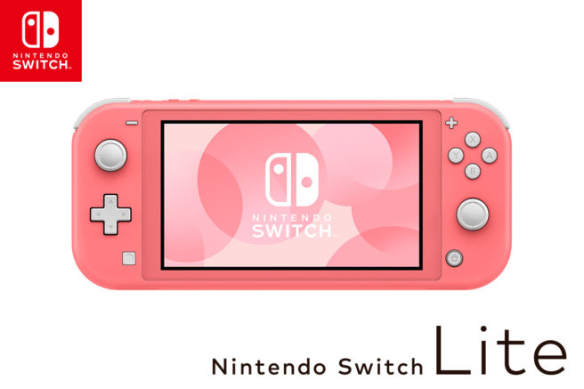
How Nintendo added coral to the Switch Lite color lineup
Nintendo hardware has always had striking color palettes dating all the way back to the GameCube with its distinct indigo, platinum silver, and spice orange launch lineup. Nintendo designer Sakai Yurkio gave us a peak into what’s involved with choosing these memorable colors in a Nintendo keyword article, explaining the thought process behind the coral Nintendo Switch Lite that debuted alongside Animal Crossing: New Horizons.
For a look into how the team settled on the coral Nintendo Switch Lite, we’ve put together a full translation of the article. You can read it below.
In Search of the Best Color
The Nintendo Switch Lite had three colors on release: turquoise, grey, and yellow. In the spring that followed about six months later, we decided to release a fourth color, one I was given the responsibility of designing. The console was still early in its life, and we needed a color that was in line with the others on offer. The release of Animal Crossing: New Horizons was also imminent, and it was important to find a color that made sense for that release as well.
The concept behind the Nintendo Switch Lite is a small, light, and easy to use device, but it’s also a kind of fashion accessory – like shoes or a purse, it’s something you show off when you’re out and about. The idea for the new color came from playing the Animal Crossing series. Looking through the potential candidates, we decided that pink would be a good choice, as there weren’t any warm colors on the existing line-up.
The word pink has a variety of different variations, from deep, vivid shades through to pale pastel. It’s a divisive color, and we needed something different to the existing neon pink Nintendo Switch [Joy-Con]. Furthermore, we were adding to the console’s standard official colors, so had to choose something that Nintendo officials in other countries would like as well.
Our searching led us to coral, a color that balanced out Nintendo Switch Lite’s four available colors that was also well-suited to the Animal Crossing franchise, with its yellowish tinge that evokes the excitement that spring brings.
It’s a color often used in cosmetics, but it has recently found popularity in electronic devices as well. It’s more novel than a plain pink, and we thought the unified messaging would make it easier to pitch to the other staff involved.
Presenting the Product to Other Countries
The surface of the Nintendo Switch Lite is wide with a rounded matte texture, and color charts and printing can greatly change how the color will look on a console. For that reason, we came up with a lot of potential color candidates and painted them directly onto consoles.
To gather opinions from our overseas staff and partners, we hand-picked prototypes and sent them overseas, showed the product off in presentations on video conferences and when we could, had partners come to Japan to see the device in person.
Everyone has their own color preferences, and different countries are going to have different opinions of the same color. Initially, there were differing opinions on the color between North America, Europe, and Japan, but once we could get the finer nuances of our color materialized onto actual units, it was a color all regions could agree on.
One of the true pleasures of working as a designer at Nintendo is that you come face-to-face with your products, as the people who buy them, in stores. Not only that, but these same products can be found all over the world. Finding a color that will catch the eye of customers all around the world is no easy feat, but we believe that the Nintendo Switch Lite’s color line-up allows more customers to find something for them.
I’m looking forward to seeing a coral Nintendo Switch Lite on my next trip abroad!
Translation provided by Jarop on behalf of Nintendo Everything.
If you use any of this translation, be sure to source Nintendo Everything and please do not copy its full contents.
