Masatsugu Saito on designing Xenoblade Chronicles 2’s main characters
Xenoblade Chronicles 2 main character designer Masatsugu Saito published a new piece today. Saito discussed how some of the characters were created, including Rex, Pyra, Nia, and more. Concept art was shared as well.
Here’s the full entry form Saito:
This is Masatsugo Saito again, and this time I’d like to talk about Rex and the other main characters.
To delineate the age difference between Rex and Pyra, we designed the characters to have a clear difference in height. Although this makes Rex look small, adding slight emphasis to the size of his arms and legs allowed us to make his movements look bigger while he fights or performs actions in the field, all of which helps to cover for his smaller stature. Rex’s outfit is a diving suit because he is a salvager working in the Cloud Sea.
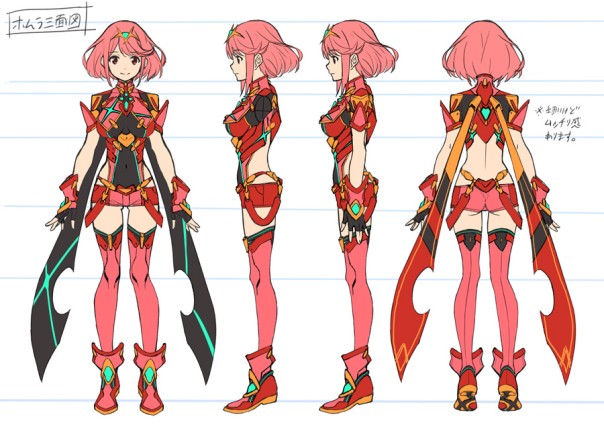
When designing Pyra, we wanted her to be a protective presence for Rex, so we envisioned her as a flame with a passionately burning core. But at the same time, we also designed her to evoke a certain sense of incompleteness as a way of reflecting the existence of Pyra’s other form: Mythra. That’s one reason the glowing areas on her body are not horizontally symmetrical, and why we partially removed the back of her outfit and cloak.
For Nia, we emphasised her loose clothing and large boots to make up for her short stature and to make her movements look bigger, much like we did for Rex. And because her hood would cover her cat ears on the top of her head, we made sure to leave room for them. I also asked that Nia would be able to ride Dromarch, and was really happy when they implemented that request!
Dromarch didn’t have much of a mane when we submitted the first design images, but we changed his design because the development team asked us to make his mane more impressive so that Nia would have a place for her hands when she rides him. We also distorted Dromarch’s face to make him look more like a cat than a real tiger. Then, we drew his head slightly larger to make his eyes and expressions easier to see.
One of the most fun jobs was designing the Nopon, Tora. Because Tora is a playable character, we made his design stand out in comparison with other Nopon by using striped patterns and his spikey mohawk. We used overalls in his outfit to make him seem youthful, and put a monkey wrench in his chest pocket to emphasise that he is a mechanic by trade.
Poppi is an artificial Blade, so unlike normal Blades, her ether lines are orange. Poppi is another short character, so like Rex and Nia, we made her arms and legs thicker to emphasize her actions. In her original form, Poppi α, we highlighted the feel of old technology through her metallic design, but in her powered up form, Poppi QT, we made her taller and gave her a more polished design to reflect her technological advancement.
Thanks for stopping by!


