New art shows a change for Link’s design in Zelda: A Link Between Worlds
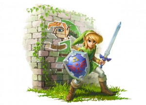
Let’s take a look at the original piece of artwork for Zelda: A Link Between Worlds:

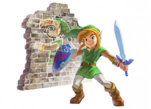
And here’s the latest image sent out by Nintendo today:

See any differences? Link certain looks different, as does his shield and background wall somewhat.
What do you prefer? The original drawing or the latest design?
Leave a Reply