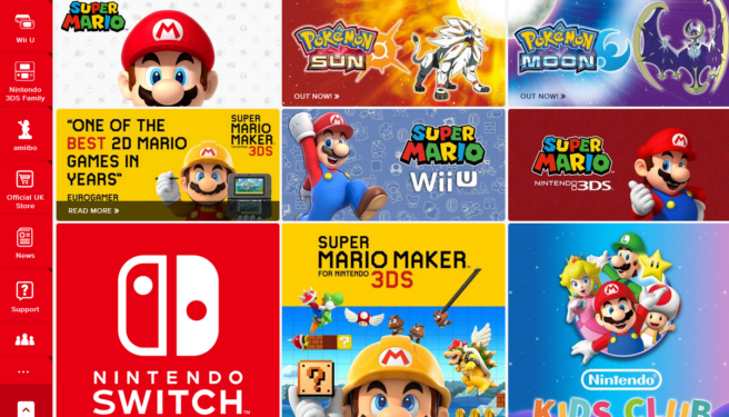
Nintendo’s European websites got updated with a new look
Over the course of the last year or so, Nintendo’s various European websites got updated continuously, getting new functionality, My Nintendo integration, a new mobile-friendly layout etc. Today they got perhaps their biggest update yet with a new header, and updated sidebar and an all-red color scheme. This is line with Nintendo as a whole moving back to their red-and-white logo and color scheme, instead of the grey-and-white that was used during the Wii and Wii U era.
More: Europe
Leave a Reply
