Nintendo artist talks about working on Super Mario Bros. Wonder, a dream come true
A little while back, an interesting piece went up on Nintendo’s recruitment website from Taku Ito, who worked on art for Super Mario Bros. Wonder. Ito discussed what it was like creating different images for the game, and more specifically, concepts for the boxart (which also acts as the key art).
Being able to work on the game sounds like it was a dream come true for Ito as someone who’s loved the series since he was a child. Still, that doesn’t mean it was easy. Ito said it was a challenge to highlight the elements of “adventuring in a mysterious world, while also mixing with the charm of the traditional side-scrolling gameplay.”
Here’s our full translation of the recruitment post:
Designing the Artwork for Flagship Nintendo Titles
At Nintendo, designs intended to convey the game’s world, such as logos and illustrations are referred to as ‘artwork’. This artwork can be used in various places such as on the game boxes, at sales stands, in catalogs, on posters and on the Nintendo website and advertisement articles. I have worked as a graphic designer and made artwork for many projects, but one that really sticks in my heart is that for Super Mario Bros Wonder.
This title was a side-scrolling game following on from Super Mario Bros. released in 1985 for the Famicom and is the first brand new title in about eleven years. When I heard that I would be in charge of artwork for a Nintendo flagship title, and for Mario – who I have loved since I was a child – I was filled with happiness from the bottom of my heart.
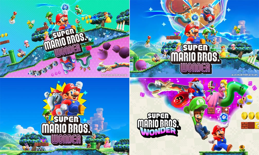
Designing While Exploring all Possibilities
About one year before the release of the game I started work. First I received explanations from the developers and actually played the then in-development game to refine the design concept. The appeal of this title was ‘wonder’; adventuring in a mysterious world, while also mixing with the charm of the traditional side-scrolling gameplay. The biggest challenge was expressing both of these elements in the package design.
One of the most important parts of my job as a designer is to bring out the charm of the product. In order to do that I explore all possibilities and make lots of test designs. For example, one plan involved centering on the new Elephant Mario and going for a fresh, strong vibe. Another was to divide the screen in two, one half with the traditional side-scrolling Mario world and the other with the fantastical ‘wonder’-filled world. We really did try and consider lots of different design directions.
Eventually in the final design, we placed Mario holding a Wonder Flower and facing right to show the side-scrolling nature of the game. Furthermore to convey the mysterious nature of the world, we placed elements of wonder behind him such as twisted warp pipes and Bulrush. And then by using a simple background with Mario jumping out, he really stands out, as does the idea of adventuring in this mysterious world.
On launch day I went to a store, held the box in my hand, and saw customers playing the game at a demo stand. I felt very accomplished as a graphic designer at that moment.
Super Mario Bros. Wonder director Shiro Mouri and producer Takashi Tezuka previously shared concepts, prototypes, and unused Wonder Effects. You can check that out here.
Translation provided by Simon Griffin, SatsumaFS, and Philip Proctor on behalf of Nintendo Everything.