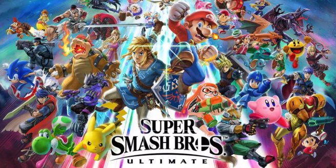
Super Smash Bros. Ultimate devs on the art and graphical style, keeping the file size low, more
4Gamer and Famitsu have published new reports on talks Bandai Namco delivered at CEDEC 2019 this past week. Talks during the events involved the art and graphical style, how they kept the file size low, and more.
Here’s the full roundup, courtesy of Siliconera:
Character Style
– Director Masahiro Sakurai’s main three concepts for Ultimate was to have many characters exist in the same world without feeling out of place, making various stages that show of the unique charm of each one, and consistent full HD and 60fps graphics
– Regarding graphical style, the main point was the change aspects of character designs so they would look balanced
– Ex: with Fox, you have a realistic style; meanwhile Mario is a deformed proportion character that is cartoony and colorful
– These designs need to be made balanced, especially as with the Super Smash Bros. series players tend to go attack characters that don’t look as nice first
– For Fox, they focused on making his silhouette more distinct, and reduced the shadows and fur detail
– Mario received more realistic-looking overalls, and a less bright color scheme
– Another thing that was focused upon was the natural lighting effects
– Apart from regular lighting, Ultimate’s lighting also takes into account the color of the surroundings
– Indirect lighting was also improved upon, in order to make the characters all seem believable existing in the same world
– A lot of effort was put into making the characters visible no matter the distance, considering Smash Bros. gameplay
Stage Graphical Style
– Bandai Namco had the task of bringing back and creating new stages, and make them all shine with unique charm
– They had to balanced the ‘game’ (functional) and ‘art’ (aesthetic) aspects of the game
– Stages in Smash Bros. Ultimate are divided into the foreground, midground, and background
– The closer to the screen they are, the more focus they get, and places where characters stand are shown as “central lines”
– Sometimes, objects are shown behind the central lines, making it hard to tell where the platform is
– To emphasize the areas characters can stand, the developers added lights and other ways to highlight the platforms and especially the edges that could be grabbed, even if the lighting was unnatural
– Each of the stages are shown at a 30-degree angle, as if the viewing angle was any higher, such as 40 degrees, characters would be mostly hidden when grabbing ledges, and might misjudge the distance from ledges
Full HD & 60fps
– The team brought over Super Smash Bros. for Wii U, and tested how much they could challenge themselves on the Switch’s more powerful hardware
– A majority of the Switch’s GPU is used on the stage, with fighters being second, followed by the system, effects, items, and finally UI
– The team had to work on pushing down the GPU loads for each character
– For larger fighters like King K. Rool, even the insides of his cape are rendered, so they reduced load by not rendering the parts that overlap with his body and aren’t seen
Technical Aspects
– The basic strategy was to reuse as much of Smash’s assets as much as possible, while problematic aspects are replaced entirely
– They needed to further optimize their development efficiency
– Reduced file size by removing duplicated data that was the same across fighters, or textures that were used in multiple parts of the stage
– Ex: Mario’s eyes and nose are consistent across the models, while the Super Mario Maker stage has reused textures and thus these things were aggregated
– Started out at 60GB early on
– Thanks to their methods of reducing filesize, the game became only 15GB by version 4.0.0
– It was able to help reduce costs
