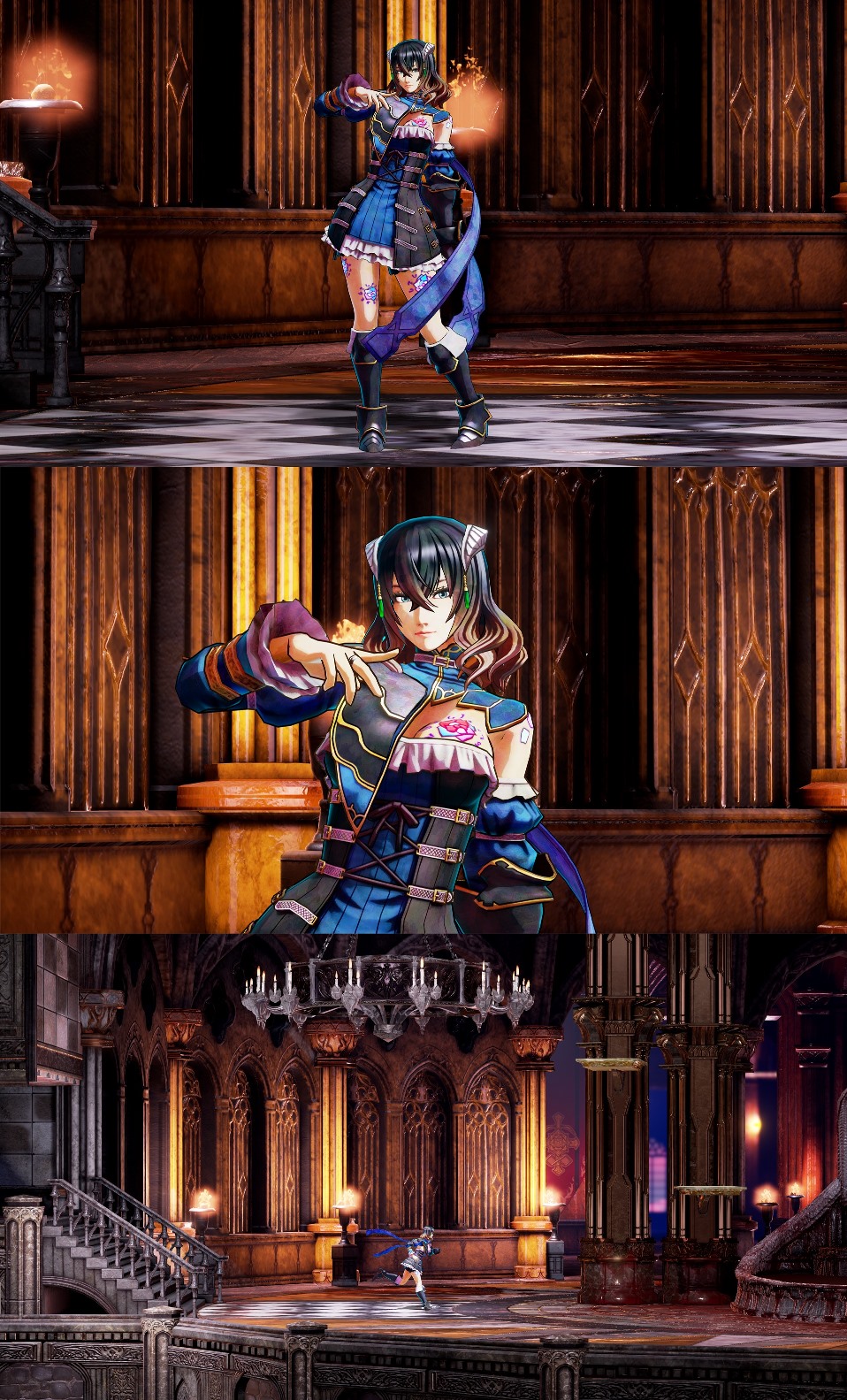
Bloodstained dev shows latest screenshots, wants feedback on shaders
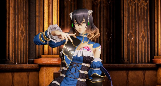
Development on Bloodstained: Ritual of the Night continues to progress. Today, a new Kickstarter update was posted regarding shaders. The team is looking for feedback from fans – based on four different options – to settle on the best style. You can vote right here.
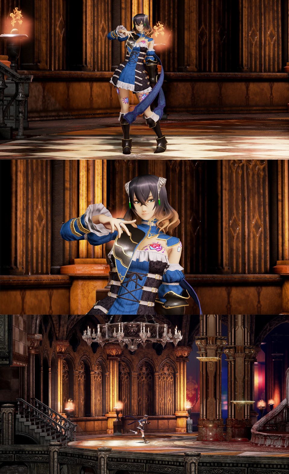
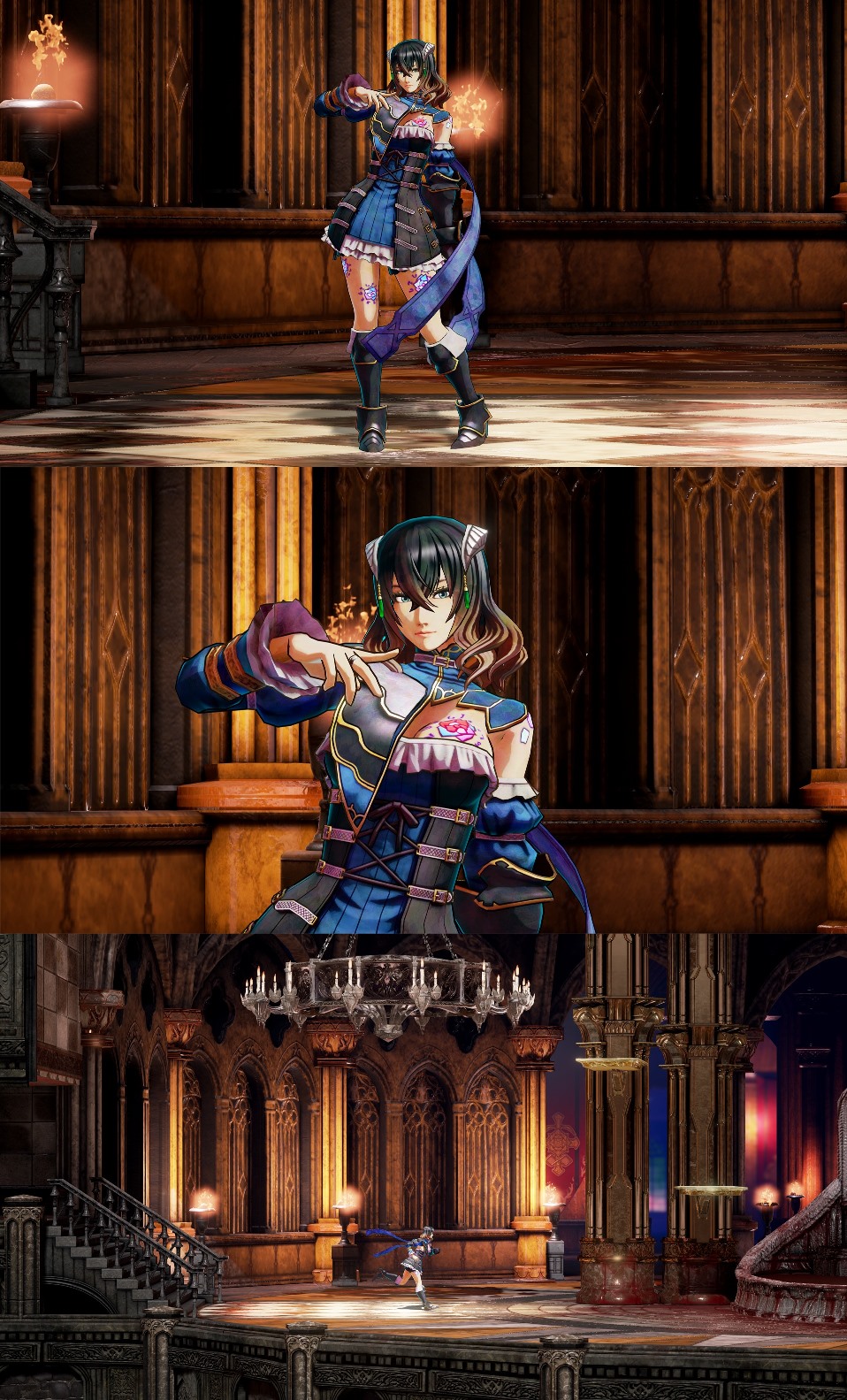
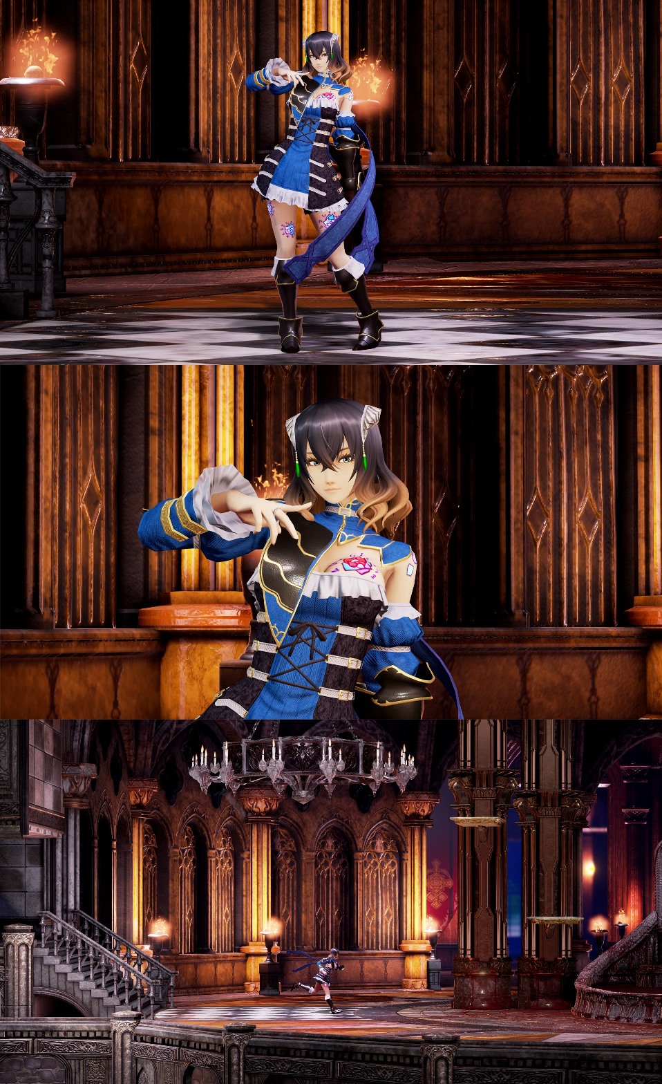
As for the different options, those are below.
Background 1 / Character 1
Background 1 / Character 3
Background 3 / Character 1
Background 3 / Character 3
And here’s the news from Kickstarter:
Greetings!
Last time, we turned to the backers for input on which shaders to use in the game. Based on that, we’ve gone back and put tons of time into making improvements. In particular, the background we revealed in the previous update was just arranged for our own experimentation; for this update we’ve put much more detail into it. This may make it easier for you to see which direction we’re aiming for.
Of course, as we add more detail to the background the characters become more prone to blending into the background. Some of you have noticed the characters’ proportions changing in the art and early screenshots—we’re making adjustments as we build the game to maximize the contrast between character and background. We’ve made more changes for this update, and adjustments will likely continue as we get farther into development.
One you may notice is that Miriam has two long ribbons attached to her shoulders now. When we tested her original graphic, it was hard to pick her out against the background, because there wasn’t much on her costume that moved or swayed. (The design of her left shoulder has changed, too, as some of you pointed out; this is the reason why.)
For this third shader, we’ve increased the contrast of the background and edited the lighting to polish the overall effect. The first shader also looks different against a more detailed background, so I think there’s a different effect to that one, too. Which one do you guys like? To be honest, opinions are divided within our team!
We spent an enormous amount of time and effort on this third character shader to create an illustration effect. We tried to get closer to the requests of backers who hoped she would look more like the original design illustrations, and when I first saw this shader, I have to admit I was so impressed I actually gasped.
So we’ve compiled a few options of these background and character shaders put together and would like to see what you think. And, as I’ve pointed out in the latest Ask IGA, this will be our final request for art-direction feedback. I’d like to ask for any final thoughts you have now, so we can move forward and start putting things in motion.
