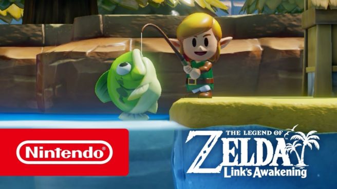
Aonuma on how the art style came to be for Zelda: Link’s Awakening on Switch
The Legend of Zelda: Link’s Awakening on Switch has a unique art style that really hasn’t been seen in the series previously. So how did that new look come about in the first place? Hollywood Reporter spoke with franchise producer Eiji Aonuma to learn more.
Aonuma was first asked specifically about the inspiration behind the new art style. In response, he said:
“The art style came about as a result of making 3D re-creations of the original characters, buildings and their exaggerated proportions as faithfully as possible. That said, we were aiming for the feel of a ‘diorama,’ so we may have been thinking about some actual miniature dioramas.”
Aonuma also had this to say about creating the dollhouse look of the game:
“We felt like a ‘miniature diorama’ style fits the concept of the small but deep setting of the original game, as well as the comical characters and brisk action. We decided to apply the tilt-shift aspect to further emphasize that.”
Zelda: Link’s Awakening originally came out for the Game Boy in 1993 with a pixel art style that suited the hardware.
