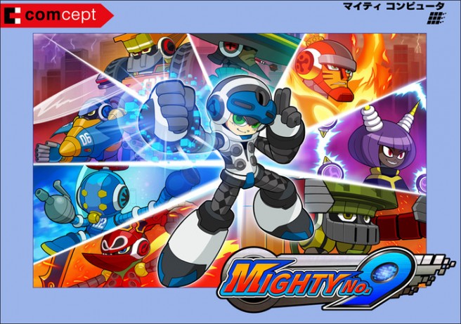
Mighty No. 9’s Beck has a slightly updated design
Beck, the main character of Mighty No. 9, has a slightly updated design. Beck now has more of a white-themed style going on.
Director Koji Imaeda explained the change over on Mighty No. 9’s official website:
From the very beginning we designed Beck to have a neutral, grey base, with the idea of wanting to make something completely new and unique.
But development soldiered on, and as we approached the last leg, we started looking closer at Beck. As a protagonist that could absorb the abilities of his siblings and take on various forms, our image of his appropriate color shifted from “neutrality” to “containing all possibilities”… and since white is a combination of all colors of light, we felt that would actually suit his character better! Hence, we went with the coloring change.
Pure and simple, this Beck is ready to take on all kinds of cool transformations. We hope you like our new-and-improved hero!
So there you have it, Beck’s look has gone from good ol’ gray to a new, noble white!
You can get a look at Beck’s new design in the “boxart” image above.
