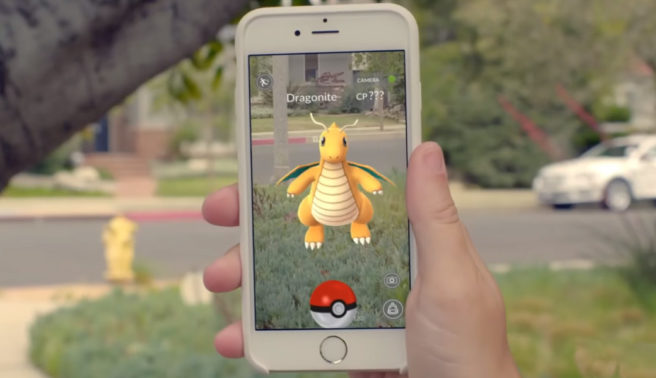
Niantic would like the game to be a social network, looking to include “more heads-up play”
The Verge recently spoke with Niantic’s Dennis Hwang, who was previously in charge of designing Google Doodles. Much of the conversation revolved around Pokemon GO.
At one point, Hwang was asked if he considers the game to be a social network. His response was as follows:
“I think we would like for it to be. That’s kind of part of the way we envision our platform, is really bringing people together. It’s not really about the specific game title or mobile phone app, it’s how do you create a shared experience that brings people together. So for Ingress, when we did start seeing boyfriend / girlfriend, husband / wife, people who are having kids after meeting each other playing our game, it was super satisfying and we were overjoyed to see that actually happening.
We’re sort of trying to paint an optimistic future, where technology is really bringing people together, not like you’re strapping a screen in a dark place to your face, where every interaction becomes through a camera, through a computer, through a network — that seems a little too dystopian to us. So we’re trying to see if there’s a better way to do things.”
Hwang later took on a question about Pokemon GO’s design and whether he’d change anything. This prompted him to speak about wanting to incorporate “more heads-up play.” Niantic wants players looking less at their phones rather than more.
Hwang said:
“Oh, there’s a lot that isn’t perfect. We had a pretty tight timeline to build this. I think just generally speaking the biggest element we’re looking to improve is allowing more heads-up play. It saddens me a little bit when I see a lot of hunched over people outside. They’re having fun, they’re outside in a great public park, but we’re always wanting a little more direct engagement with our immediate surroundings. So those are design choices we’re looking at carefully to keep improving it.
Like let’s say in the current interface, some of the information about a pokémon that spawned is in fine detail and the icon is really small. It’s going to make you go closer to the screen. We may just iterate on the design until you feel like the information is being presented to you in a way where you’re not having to stick your nose on the screen. It could be a simple size change, or the way the notification is animated, or it could be auditory cues instead of visual cues. There are a lot of options we’re going to explore.”
