Nintendo on the behind the scenes creation of Zelda: Breath of the Wild
At CEDEC 2017 last month, Nintendo held a presentation dedicated to The Legend of Zelda: Breath of the Wild. It focused on approach to development and behind the scenes creation from a technical standpoint. It’s not the sort of thing that you’re normally able to hear about it, but it was pretty darn interesting.
Matt Walker combed through everything that was shared at the presentation and shared a summary on Twitter. We’ve rounded up all of the notable tweets below.
Got around to reading some of the BotW CEDEC articles. Interesting fact –
https://t.co/494TwAuYxi— Matt Walker (@gypsyOtoko) October 3, 2017
They managed all of their tasks by integrating their management tools with the game, so you wouldn't get people doing the same work twice. pic.twitter.com/ZZsMNSlSZh
— Matt Walker (@gypsyOtoko) October 3, 2017
A task could be created by setting up a sign in the world, and then all related specs and meeting details related to it – pic.twitter.com/NU5kaPy5ng
— Matt Walker (@gypsyOtoko) October 3, 2017
could be readily available by clicking on that sign. There's also a "field task view" that was set up for higher level items. pic.twitter.com/Y6jvT7yNSV
— Matt Walker (@gypsyOtoko) October 3, 2017
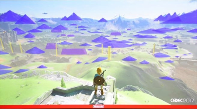
From a field design standpoint they discuss the "Triangle Rule".
— Matt Walker (@gypsyOtoko) October 3, 2017
They explain that using triangles carries out 2 objectives- gives players a choice as to whether to go straight over the triangle, or around pic.twitter.com/RPAGk54XGD
— Matt Walker (@gypsyOtoko) October 3, 2017
and it obscures the player's view, so designers can utilize them to surprise players, make them wonder what they'll find on the other side. pic.twitter.com/0ECKE6oUv6
— Matt Walker (@gypsyOtoko) October 3, 2017
There's also variations that can be more visually interesting, to perk the player's interest. Korok seeds are usually found in these. pic.twitter.com/TEcDFwycBB
— Matt Walker (@gypsyOtoko) October 3, 2017
They have 3 different scales that they utilize this principle with as shown here – all to achieve different objectives. pic.twitter.com/FjmNvP0w8l
— Matt Walker (@gypsyOtoko) October 3, 2017
They also used rectangles as shown here. Instead of gradually revealing something, rects are good for completely hiding something from sight pic.twitter.com/oqSp5oMxwv
— Matt Walker (@gypsyOtoko) October 3, 2017
You can get an idea for just how widely this concept was applied in this image. pic.twitter.com/ecGGSBfnDn
— Matt Walker (@gypsyOtoko) October 3, 2017
They give an example of how the design was applied in action in these images. Note how the structure in the distance is slowly revealed. pic.twitter.com/hyOFHg7v76
— Matt Walker (@gypsyOtoko) October 3, 2017
Finally, the structure hides the tower in the back, so there's this chain of interest – hill -> bridge structure -> tower. pic.twitter.com/E3lTOKWYrD
— Matt Walker (@gypsyOtoko) October 3, 2017
From IGN Japan on debugging. One guy foresaw that the game would be too complex to leave debugging till the end, https://t.co/iHiMeYWv9r
— Matt Walker (@gypsyOtoko) October 3, 2017
Also to implement a tool for easy bug reports, merging the tools for managing bugs with tasks, and implementing a system in the game for
— Matt Walker (@gypsyOtoko) October 3, 2017
Going back to the first article – I skipped over summarizing the first half because the latter half was more interesting to me…
— Matt Walker (@gypsyOtoko) October 3, 2017
The beginning of the presentation discusses what specific changes they made in order to make the game more enjoyable.
— Matt Walker (@gypsyOtoko) October 3, 2017
The first map images show 2 heat maps – showing what paths players originally traversed in playthroughs, and then the second map showing.. pic.twitter.com/Bp1X11Gd7H
— Matt Walker (@gypsyOtoko) October 3, 2017
how much more well distributed that became after they made this specific change.Their initial assumption was that they could spread the.. pic.twitter.com/sNcF0bxp71
— Matt Walker (@gypsyOtoko) October 3, 2017
towers throughout the map, and place game events in between, but they found that approach didn't feel appealing to players.
— Matt Walker (@gypsyOtoko) October 3, 2017
Players felt they were being guided, that the game was too linear, and people were having completely different experiences, in a bad way. pic.twitter.com/jEJG4tspWM
— Matt Walker (@gypsyOtoko) October 3, 2017
They realized they could solve these problems with the concept they called "gravity"
— Matt Walker (@gypsyOtoko) October 3, 2017
placing structures of varying visibility/importance in dffrnt places,leading players in different directions and allowing to get sidetracked pic.twitter.com/5HKLpUosOe
— Matt Walker (@gypsyOtoko) October 3, 2017
This became a catalyst for "infinite play" – going back and forth between different structures. pic.twitter.com/NQoGjkQmG6
— Matt Walker (@gypsyOtoko) October 3, 2017
You can see in this image how the different structures rank in visibility – naturally drawing player's attention, and in "objective". pic.twitter.com/xlTargVRHf
— Matt Walker (@gypsyOtoko) October 3, 2017
The objective order changes depending on how the player likes to play-if they're aggressive, they'll go after enemy camps to get better gear
— Matt Walker (@gypsyOtoko) October 3, 2017
