Nintendo Switch Sports dev on the game’s UI and UI design, making the controls easy to understand, more
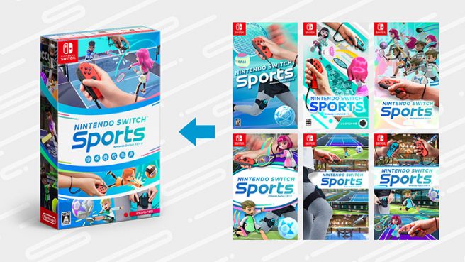
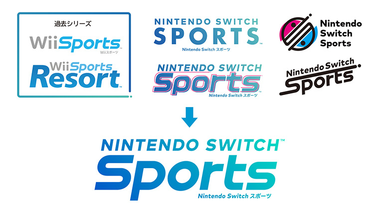
Nintendo Switch Sports developer Toshiki Otani recently posted an interesting blog about what it was like handling the UI and UX elements of the game. We also have a look at what seems to be different boxart (above) and logo designs (below) that were considered.
UI and UX elements are often overlooked when it comes to creating titles, and it’s especially important for Switch Sports given how it’s intended for people of all ages. Otani brought up aspects such as making the controls immediately easy to understand, cutting down on explanations, and more.
Here’s our full translation:
When it comes to designing jobs, there are different types, such as levels, characters and effects. However, when it comes to the UI/UX design that I was involved with, my role is very important, especially when working on highly interactive games. UI is short for user interface (point/surface of contact), and UX is user experience, in short, they are bridges that connect customers to the game, and require you to imagine how the game is to be played while designing.
Nintendo Switch Sports, a game that I was involved in as a UI/UX designer, uses intuitive controls with the Joy-Con, with sports modes that could be quickly played even by someone playing for the first time. Therefore, it was necessary to design the UI/UX while imagining a person who has never touched a game before.
While this game could be played by up to four people at once, in reality it was designed with more than four people gathered around the television in mind. That is why it was necessary to make it so that when players switch, who is playing as which character is intuitive even for people who are new to games. In game displays, it is common for the first player to be shown as P1 and the second player to be shown as P2 and such, but these words would be unfamiliar to inexperienced individuals. Nintendo Switch Sports purposefully forgoes the use of those expressions, and we began considering the use of the players’ names as signs instead.
The Nintendo Switch is able to recognize the color of the Joy-Con as well as whether a left or right one is being used. Using this function, we can display the color and orientation of the Joy-Con on the game screen with each character. By connecting the Joy-Con being held with the Joy-Con on the screen, anyone can easily understand. Also, we worked to make things intuitive by having the Joy-Con vibrate when it becomes one’s turn.
Realizations in the trial-and-error process
When developing a game, we think about the specifications, and sometimes we can no longer guess how a first-time player would react to it. That is when we have various people try playing the game, such as those who do not play games much. We learned a lot when we did that.
For example, we had instructions asking people to “Please press this button” or “Please take up this stance”, but where is the button? Or what stance should they take? It was not clear to some people.
If people try to play without holding the Joy-Con properly or taking up the proper stance, they will not be able to experience the actual fun of the game, and will only be left with the feeling that they could not control it correctly. That is why we have large displays to let people know where the buttons are. Also, we improved how we convey instructions for passing on the Joy-Con, taking up stances, and other actions that players need to perform in front of the TV with text and illustrations. However, when we try to be too considerate and put in too many explanations, it could make people feel that the game is not letting them play.
Such things concerning the game experience were worked on through consulting with the planner and trial-and-error. As a result, for controls that could be understood with just one look, we made changes to have instructions be displayed only at necessary timings, reducing the amount of times the instructions were shown, and redisplaying them when needing to change the way the controller is held etc.
Instead of explaining everything, we reduced the amount of explanations for complicated techniques that do not impact the fun of playing, and worked to make it so that players could discover them on their own while playing and learn them through practice, just like with real sports. Through trial-and-error, we designed it so that a variety of players could play without the tempo of gameplay dropping.
After Nintendo Switch Sports was released, on places such as social media, I saw parents who do not play games much post pictures of their children playing this game while saying “I’m glad I bought this game”, or elderly people enjoying the game greatly, and when I see these posts, I once again feel the true value of my job.
Nintendo Switch Sports is now available.
Translation provided by SatsumaFS and Simon Griffin on behalf of Nintendo Everything.

