[Let’s Talk] What are you playing? – October 2017
A new month is here! We just entered October this week, so that means we want to know what you’ve been playing.
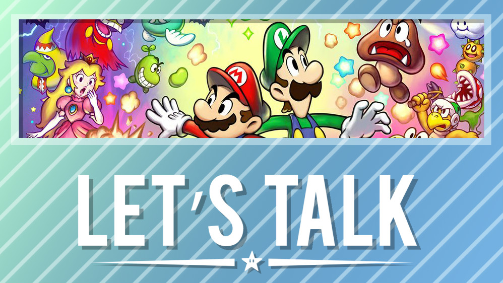
Have you started up something entirely new for the month? With all of the new indies on Switch, have you given any of them or a try? Or maybe you’re starting up Mario & Luigi: Superstar Saga + Bowser’s Minions, which launched yesterday. Whatever the case, let us know in the comments below!
Highlights from last week’s topic: Do you care about Switch home menu icons?
Mark
This might be unpopular – but the only reason that I care about the game’s icon is because the Switch’s OS is so unforgivingly rigid. I wish that I could change the size, structure, and create folders in the same way that I do with my 3DS. That way, if the Zelda icon suddenly changed into something stupid, I’d just shrink it or hide it in a folder.
I wish that the Switch had an OS update, to both their main Home page and to the eshop. Both are so cut-down and basic compared to what I was used to with the 3Ds.
ecoutercavalier
I think they’re pretty important. Not more important than the quality of the game, but with the growing popularity of digital games there isn’t any reason to have ugly looking icons. I’ve definitely turned down physical purchases for digital when I don’t like a boxart. It won’t stop me from buying the game altogether, but I do sympathize with the people who are asking for better looking icons.
DonSerrot
A game’s icon isn’t really all that important to me. It’s only there to help me get to the game I want to play. That said, I completely understand what Nintendo is going for with their guidelines. Icon’s on the Switch’s menu take up a lot of space and they want devs to use that space to showcase what their game is better. If it was on a smaller screen like a phone or a 3DS you would want a simpler icon because of how the details would get crushed at a much smaller size. There’s also the big problem in mobile games where copycat games try to replicate the icon of a more popular game to trick people into downloading their game and I’m sure Nintendo doesn’t want that sort of thing to start happening on the Switch too.
So I’m kinda a middle of the road here. I like seeing devs listening to their fans and fixing things even if it’s making something insignificant look better but at the same time I’m not going to make a big deal of it myself and I won’t let it affect my enjoyment of an otherwise good game. I’ve been using Android for eons and I’m not pitching a fit about Google not following their own icon guidelines and that’s a situation that comes closest to being legitimate, this is well below that I’d say.