[Review] Mario Tennis: Ultra Smash
System: Wii U
Release date: November 20, 2015
Developer: Camelot
Publisher Nintendo
Author: Austin
Super Smash Bros. for Wii U is a game that lacks guidance when you start it up; it’s a mish mash of menu options, and they don’t tell you which icon to try first. But where Smash Bros. uses a lack of direction to overwhelm– like Charlie entering Wonka’s entirely edible room– Mario Tennis: Ultra Smash feels a lot less excited about its own content. Even the game can’t be bothered to show you around.
“Well, here’s all this stuff I guess.”
What should I do first?
“Uhhhh…”

It’s a serviceable tennis game, of course, and there’s a fair amount to like about what substance is actually here. Any video game tennis veteran knows the basics, but for objectivity let’s go over the flow of the game anyway:
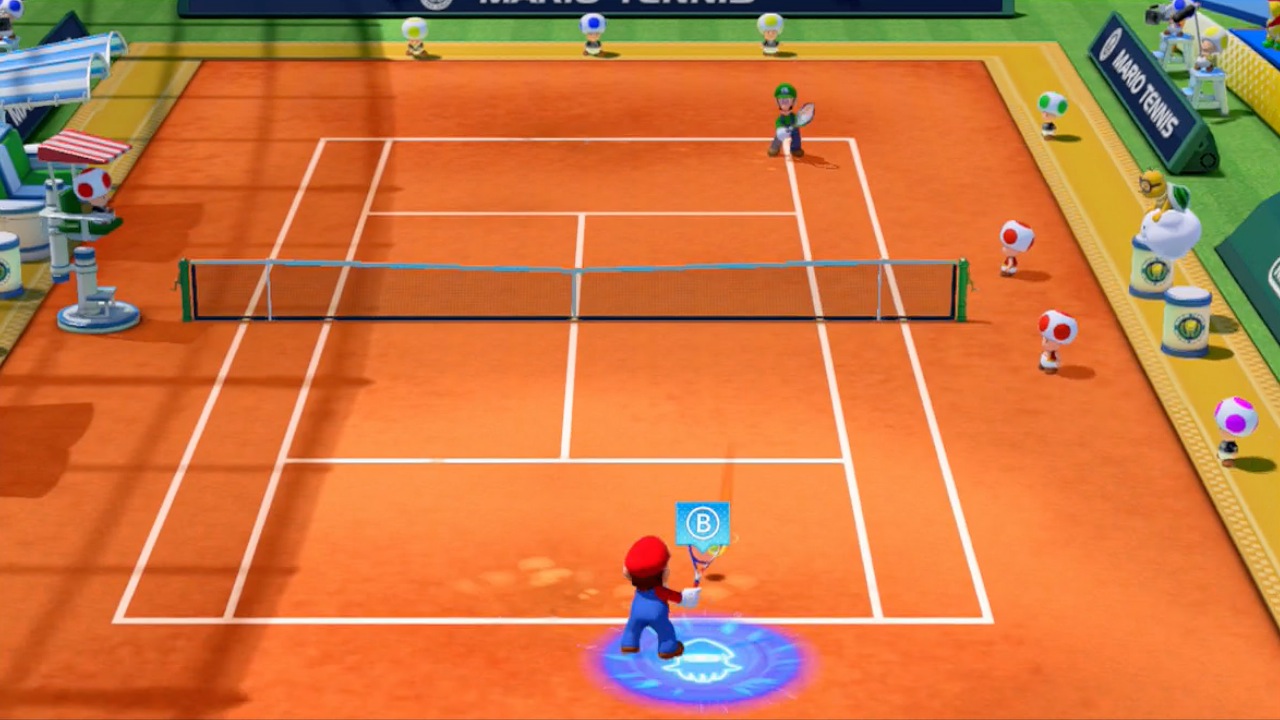
You whack a tennis ball back and forth, over a net placed in the middle of a court using nearly any of the buttons on whatever controller you’re playing with. Whack it with ‘A’, whack it with ‘B’, whack it with all four face buttons if you like– in many contexts it simply doesn’t matter. So you get into a flow of ball-whacking: Peach hits the ball at you, you hit it back at her, she hits it back and you, and so on and so forth. Whoever misses the shot first forfeits a point to the other player.
It’s simple, but it’s a fun flow. It’s often a game of trickery in a sense, because it’s easy to fall into a routine of hitting the ball back at the complementary angle it came in from, so points come from opting to step in and break the momentum at the right moment. If the ball comes in from your left, it’s easy to hit it back to your right– to follow the momentum that’s been given to you– but winning comes from choosing the right shots to go against the grain, to hit it back at an unexpected angle. You have to be aware, your opponents have to be aware, and being aware and succeeding is ever-enjoyable.
Most of the modes also include these colored circles that appear on the ground after the ball has left your opponent’s racket that do two things: First, they indicate roughly where the ball is headed to make responding easier, but secondly, each colored circle has a corresponding button on the controller. Step over the colored circle and hit the button that goes with it, and you’ll do a special shot– some of them curve, some go extra fast, some extra slow, etc. There’s no strategy that I can tell to managing these circles since you don’t have any control over what colors appear when, but having to read them quickly and react adds a few more beats of rhythm to matches that would otherwise be satisfying, but less dimensional.
So it works. The core gameplay, when you’re actually in the game, is fine.

But surrounding this gameplay nugget is nothing. Zip, zilch, nada, diddly– no tournaments to progress through, no story mode, no chance at movement or progression, no fancy adornments of any value to give you a sense of purpose. You push ‘A’ after you start it up, and then you’re on a menu with a bunch of things you can choose to do. Maybe you choose “mega battle” (or what however it’s called) because it’s the biggest icon, get bored and try something less uncontrolled, get bored of whatever that was and try something else– you’re lead not by a curiosity or an eagerness, but by a begrudging wandering from icon to icon.
This complete lack of context is, technically, the most honest way to present the content, and there’s nothing wrong with a lack of context. The game is pretty much all-gameplay, with menus feeling utilitarian instead of imaginative, so you can focus entirely on the cyclical passing of a ball from one side of the screen to another. In one way, the game may as well go the full length of the concept and turn itself into Pong, but in doing that you’d lose the shiny visual effects; the thin pretense of excitement that they use to make the game look somewhat more interesting in trailers.
And that’s really the problem: It has a lack of context, but an excess of… excess. It’s not a simple, streamlined, no-frills tennis game like Pong– it’s a game that pretends to be substantive, but isn’t that much more than Pong. And so, the excess is contradictory. Maybe even a little condescending. Does the game think we’re being tricked?
Comparing the game to Pong isn’t entirely negative though– Pong is fun! It endeared people for good reason, and it’s in the same ways that Ultra Smash might give you some amount of enjoyment. But Pong was committed to its simplicity; it was black and white, and not all that noisey (sure, it was because of technical limitations, but still) whereas Ultra Smash is nearly just as vacuous, but wears a shiny coat. All of the extra modes, all of the shiny giant characters, the enormous selection of nine identically rectangular courts– it’s all to make something small and unimpressive seem bigger and more important. It’s the game version of an unremarkable child wearing a big, cheap suit.
Yes, there’s a certain separation between the more “random” modes with the super mushrooms and the more “pure skill” modes that strip away the frippery, and there is online play, and these things aren’t trivial. But they aren’t that substantial either.
So, ironically, the biggest problem with this game– one that has so little content as it is– is that it’s not simple enough. It would feel more cohesive if it just admitted that it wasn’t that big, got rid of the condescending smokescreen, and committed to what it is at its core: A small, fun, unremarkable tennis game.
The smoke is so thin you can see through it anyway.

The launch price for Ultra Smash indicates that Nintendo may need to be more diligent about their selection process for market research, as they seem to have surveyed some people with an unreasonable love of mediocre video game tennis.
Still, if you do love arcade tennis (a lot– a lot), then I guess another one of these can’t really hurt.
Want to participate in more NintendoEverything goodness?
Try our Facebook page!
Or our Twitter page!
