Pokemon logo creator reveals early and unused designs
Nearly three decades after Pokemon made its debut in the west, the creator of the franchise’s logo has come forward and revealed some early designs that were left on the cutting room floor. IGN relayed the images and news this week.
Many years ago, Chris Maple – through his company Media Design – received a phone call from the secretary of Nintendo of America president Minoru Arakawa. Maple was asked to come over for a visit, with the only information given is that the company wanted him to work on a new game.
During that meeting with Nintendo, Maple was told about Pocket Monsters as it was known in Japan, but there were plans to call it Pokemon in the west. Because of the name change, a different logo was needed. Maple was actually given very little direction, though it needed to be done in a month to make a deadline for its showcase at E3 1998. Nintendo also didn’t have much to show to give inspiration other than some paper and toys like a tiny Pikachu figurine and a bit of information about the game. He was also told that the logo would need to be suitable for use on a small and pixelated Game Boy screen in both color and black and white color schemes.
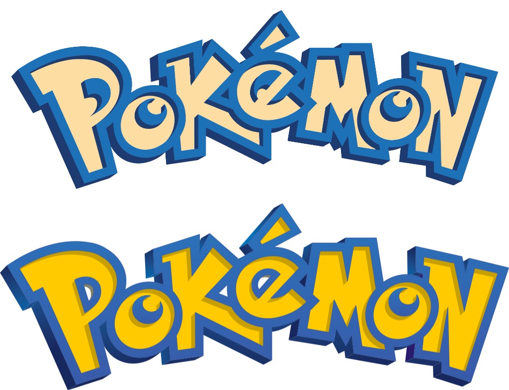
Below are some of the designs came up with:
Maple later visited Nintendo to show off the designs he came up with. Eventually he brought out his favorite one, and former Nintendo of America executive VP of operations Don James signed off on it.
As for why Nintendo accepted the logo, Maple told IGN:
“Energy in it. Also, when I was trying to take some of the real rough sketches from the original artists that did it for the person who started the game, I was trying to envision the story. There’s a story in everything, the story, brand story, what it possibly could turn into.”
After the Pokemon logo was decided, Maple was actually connected with Nintendo again since Arakawa wanted it to be altered slightly. That was all he had to go on, but he told IGN that it’s not unheard of to receive that sort of request in his field. Maple ended up making slight changes to the interior of the “P” and the “E” (see above – final version is on the bottom), and that’s how we ended up with the famous Pokemon logo.

