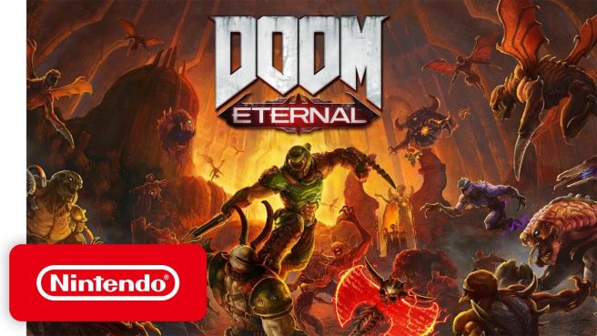
After releasing on Switch last month, Digital Foundry has now taken a closer look at the Switch version of Doom Eternal. Despite sacrifices that were made, the publication views the port positively and overall feels what Panic Button has accomplished is impressive.
Here’s a summary of how Doom Eternal holds up on Switch from a technical perspective:
– Average resolution comparable to Doom 2016 despite the increase in visual complexity
– Higher pixel count than Wolfenstein II on Switch
– Maxes out at 720p when docked, but can dip to just below 540p when taxed
– 600p is the ceiling in portable mode, but can drop to 360p
– Overall scene complexity, lighting, and effects are in tact
– Texture detail reduced on Switch, though the reduction varies
– Most commonly viewed textures have a higher resolution appearance while smaller flourishes are blurrier
– Per object motion blur and other post-processing effects removed on Switch
– No depth of field when performing a glory kill
– More aggressive LODs in certain areas and lower precision volumetric effects
– Particles removed somewhat on Switch
– Digital Foundry noticed vertical lines that can be seen which may be an artifact of the dynamic resolution scaling system
– Density and complexity of maps retained on Switch
– Animation quality also remains
– Maintains 30 frames per second most of the time when docked
– Portable performance fairly comparable to docked, but there’s an increase in frame pacing issues
– Cutscenes in portable mode capped at 20 FPS with bad frame pacing
You can view Digital Foundry’s full analysis below.
