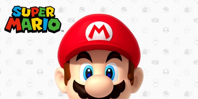
McDonald’s had wanted the “M” on Mario’s cap to more closely resemble its logo
Mario’s cap is highlighted by the “M” at the very front. Meanwhile, the McDonald’s logo also prominently features the same letter. Did you know that the restaurant food chain wanted more synergy between the two at one point?
Yoichi Kotabe, who worked as an artist at Nintendo for two decades, revealed the news in an interview with French publication Le Monde. When asked about his first assignments, he mentioned coming up for various Mario designs and poses before eventually making the boxart for Super Mario Bros. 3. Kotabe went on to mention that he emphasized the “M” of Mario’s cap and wanting to distinguish it from the McDonald’s logo – despite the fact that McDonald’s wanted the hat to resemble its logo more.
Kotabe shared the following (via Google Translate):
“At first, I drew reference images for external service providers, by-products, stickers, etc. I drew Mario dancing, dressed in a New Year kimono, cowboy, etc. Later, I was asked to make the jacket of Super Mario Bros. 3. I asked Shigeru Miyamoto, Mario’s creator, what was his personality. He said to me, “Do what you want, but Mario does not kill.” I always made him confirm.
I kept the thick outline of the character. On the other hand, I emphasized the features of the “M” on the cap of Mario, to distinguish it from McDonald’s logo, which asked us, on the contrary, if they could resemble each other more.”
Later in the interview, Kotabe noted that he would end up redrawing Peach, Donkey Kong, and Luigi. Mario was intended to be dynamic and full of energy whereas Luigi is more timid and reserved.
