Zelda: Breath of the Wild art director on how The Wind Waker HD shaped the game’s art style
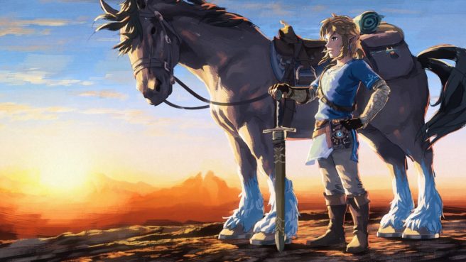
As you can probably tell, The Legend of Zelda: The Wind Waker HD served as a big inspiration for the art style in Breath of the Wild. This goes all the way back to when Nintendo was working on the Wii U remaster a few years ago. Breath of the Wild art director Satoru Takizawa spoke about how the game’s style was determined during a session at GDC last week.
When looking to see how different Zelda games would look like in HD, Nintendo took models from previous games and placed them into a development environment to try different mockups. Skyward Sword, Twilight Princess, and The Wind Waker were all tested. Wind Waker “stood out” the most “and really captured the imagination of the lead artists on Breath of the Wild”. The team took it from there.
While Wind Waker would end up being used as inspiration, the art style couldn’t be carried over completely. The cartoonish direction couldn’t allow for a certain sense of realism that the team wanted to achieve. Additionally, there was some concern about it being a turnoff for older players.
Breath of the Wild’s final look was ultimately determined based on a slogan Nintendo decided on, which is “refreshing and full-flavored.”
Here’s the full explanation on how the game’s art style came to be from Takizawa:
“This new Wind Waker art stood out from the other HD mockups and really captured the imagination of the lead artists on Breath of the Wild, myself included. This art guarantees playability from all aspects, including visibility and action, and still allows the construction of a unique reality. It’s an art style with which it’s super easy to lie. It has great originality and has remained fresh even after ten years. And it feels good to play.
This led to the official creation of The Wind Waker HD remake. It’s also connected to something that happened one day, and led directly to the finalization of the art direction for Breath of the Wild. One day during the final stages of The Wind Waker HD development process, I was summoned by Breath of the Wild director Mr. Fujibayashi and producer Mr. Aonuma. Mr. Fujibayashi pointed to a Wind Waker screen and said, ‘This right here.’ ‘Right?’, I replied. The other artists and I were in complete agreement, so I did not hesitate to speak out. Mr. Aonuma said, ‘I agree.’ And with that, it was decided. The whole thing took less than a minute. It was really surprising at the time, but looking back now and seeing how the game lost none of its originally or playability over the course of development of The Wind Waker HD, plus the fact that the entire staff witnessed the solidification and expansion of the game’s reality day after day, our agreement on the issue seems quite natural.
… We continued with exploring art creation based on The Wind Waker, and came up with our final art creation slogan: refreshing and full-flavored. This is the very important art creation slogan we adopted for Breath of the Wild. … So, why did we choose this slogan?
There was actually one weak spot in The Wind Waker HD art style. An important point in Mr. Fujibayashi’s game concept was to fill the vast game world with fun, multiplicative experiences using physics and chemistry gameplay, and this was difficult to achieve with The Wind Waker HD art style. Why is that? The Wind Waker art style in its depiction of form, feel of materials, etc. is very stylized. One of our goals was to have the art intuitively suggest possible physics and chemistry gameplay based on the player’s own experiences in the real world. The problem with The Wind Waker art style is the lies it told were too big. There was also another concern with The Wind Waker art style. The concern was if older players could look at the screen for just an instant and understand everything they were seeing, they might feel the art was intended for children, and was not for them.
So basing the art on something easy to tell lies with like The Wind Waker art, we could more easily guarantee function conforming to playability, and more easily construct a reality within the game. Above and beyond that, we needed to suggest things anyone could do in the real world, so we needed a certain level of realism, and we needed an information-dense, mature art style. Our goal of supporting these elements equally led to refreshing and full-flavored. So we made this our slogan, and it led to the establishment of the final art style. Shaders, lighting, models, terrain, effects, UI, weather environments – our slogan is the foundation upon which all these sections constructed their designs and behaviors. So a fairly streamlined tempo and event presentation was necessary to efficiently present the Breath of the Wild’s game tempo and game style.”
