[Weekly Screenshot] Art of Balance Wii U #3 – Perfect Imperfections
As we’ve done for the last two weeks, today we have another exclusive screenshot of the upcoming Wii U eShop game Art of Balance from our friends at Shin’en. They’ll be showing off some genuinely neat stuff this time around, including some changes to the core user-interface and some of the small graphical touches that their known for putting in all of their games. Like before, the following quote comes from Mr. Manfred Linzer over at the developer, and you can look at the screenshot he’s talking about above:
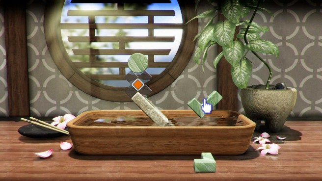
Hi guys! Another week, another screen from our upcoming beautiful Wii U game called “Art of Balance”. This time I’ll show you a screen from the 2nd world.
When creating the Wii U version we thought about how we could make the game feel more ‘real’; a subtle but nice change was how to pick the shapes. On 3DS and Wii, the shapes were simply picked from a 2D HUD Layer and then projected into the 3D screen. On Wii U, we placed the shapes directly on the table, so you can select them with your GamePad or Wii Remote. This feels very natural and gives a more ‘solid world’ feeling.
Also we wanted the game to feel ‘gemuetlich’ as we say in German, so the levels should feel warm and inviting. Besides choosing the correct lighting and props, we figured out that it was important not to have that typical ‘clean’ computer rendering style, so we tried to give everything little imperfections. Just look at the table – all of the little scratches and variations in particular. This is used on every asset in the game. It’s very subtle, but gives that little extra touch we wanted.
Now for some tech stuff. For the plants, we again used our screenspace subsurface rendering to emulate the transparency of the leaves. The far background has a dynamic ‘bokeh’ effect to help the player focus on the play area. From behind warm sun rays shine through the window. To achieve the very soft look, we used a radial blur with 512 samples for each ray. Maybe a bit over the top, but as the sun rays interact with the shapes you move, it was important to have a flawless look.
Another tiny but nice effect is the chromatic aberration in the glass shape. It’s dynamic and simply looks gorgeous when you move these shapes.
To achieve high-quality reflections, we rendered the whole scene three times. The water plane acts as a mirror and so does the table, on the smoother areas. Another option would have been to use “screenspace reflections”, but this would have caused too many artifacts in this case.
For post processing there is a bloom for bright parts of the HDR image. It’s very soft but makes the whole scene more believable. Also some sub pixel chromatic aberration is added on top to mimic a real lens and to further soften the image.
Next week I’ll tell you about the split-screen multiplayer mode and water simulation. Thanks for reading!
