[Review] Squids Odyssey (Wii U eShop)
System: Nintendo Wii U
Release Date: May 22nd, 2014 (NA/EU)
Developer: The Game Bakers
Author: Austin
Almost three thousand years ago, a shy fellow (I don’t know if he was shy) named Homer lived in Greece, and he wrote two really famous epic poems: The first– The Illiad— is thought to be the oldest surviving piece of western literature ever. The second– The Odyssey— is just as famous, and this week, nearly three millennia after its initial writing, The Game Bakers have created a work directly inspired by the work of Homer for the Wii U eShop. It’s called Squids Odyssey.
Most of what is written in the paragraph above isn’t true. Squids Odyssey does exist, but it’s not a game based around Homer’s Odyssey— no, it’s a creative and unique turn-based strategy game set far beneath the surface of the ocean that’s unfortunately marred by a lack of technical polish and attention. Still, it may be worth your time; read on for details.
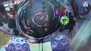
The visual style is very much like a storybook. Long strokes of muted colors create background images and distant iconography that set the stage for your adventure, and characters that look as though they could have been plucked right from the shelves of the adolescent section in a local library populate the world. It all looks, objectively, very nice. Very clean.
Right from the get-go, unfortunately, the interactive elements begins to show wear-and-tear. Menu icons are slow to navigate with the thumb-stick and face-buttons due to their disorganized layout and a pretty hefty delay on your cursor, so often times it’ll take a few tries before you can get that floating hand to land on the icon you’re looking for. On top of that, there’s a half-second delay or so between when you select menu options and when they load up, despite the game’s only load-necessary assets being another set of menus. It’s too bad, when the aesthetic is so pleasant, to have this sort of technical upset so early on, but at first it’s a relatively minor complaint.

When you finally get yourself into the game, the gameplay instantly comes across a pretty interesting: Though it’s turn-based strategy– following loosely in the vein of things like Fire Emblem or Final Fantasy Tactics— movements aren’t handled with the same no-dexterity-friendly selection system. To move your four troops in Squids Odyssey, you have to aim the character by pulling back on the left thumbstick in the direction opposite your desired path and then push ‘A’ to “release” your fishy-friend in a slingshot-like manner. Pull back further to launch your squid farther, or lightly tilt it for a short step to one direction.
Attacking enemies is handled, by and large, in this same way: Slingshot your body into an enemy to deal damage and knock them back, and defeat an enemy either by depleting their HP or knocking them off an edge. The fact that both options are present creates a very fundamental layer of strategy that the game builds upon as the levels progress; though it’s very easy to knock an enemy off a ledge to net yourself a one-hit KO, it’s also very easy to get pushed off an edge yourself or to overshoot and fling yourself off, both of which cause you to lose your character for the rest of the battle, excepting revival items.
What this means is that all characters– no matter whether they’re “scout” class, “shooter”, “healer”, or whatever the fourth one is named– have a pretty substantial ability to defeat enemies under the right circumstances, but risk an easy death as part of the trade for that ability. This risk/reward system is continuously expounded upon as the game progresses and introduces various level-specific mechanics that always force you to make even more decisions and take even more risks. An earlier element, dynamite, lets you deal a large amount of damage to many enemies, but it’s only activated when touched. You can position yourself strategically in order to knock another enemy into it, or– if you’re in a bind– you can hit it yourself in a sort of pseudo-kamikaze effort. Risk-reward. Another, more common level element are spiny obstacles that are strewn about liberally. These, like the dynamite, aren’t inherently helpful– though they give weaker classes like the healer more power to deal substantial damage via pushing an enemy into them, they also present a threat to you because you can take damage from them as well. More risk-reward.
A well-placed shot can have pretty drastic effects on the battlefield.
A hugely variable set of these sorts of level obstacles are continuously introduced into the game, from teleporters that move you around the map to jetstreams that can move you around more efficiently when used properly to seahorses that can be ridden to increase mobility. And nearly every one of these elements– of which there are many more I have not listed– is neither wholly good nor wholly bad. They all have a risk/reward factor and require a fairly comprehensive use of strategy to take advantage of effectively.
Thankfully, supporting these strategic elements is a difficulty level that forces you to use these strategic elements. Too often might we see a game that has an astounding depth of strategy but not enough enemy toughness to coax you into using it; not so with Squids Odyssey. The game gets very suitably tough pretty early on in the first (of ten) mini-campaigns, and it’s almost certain that– if you don’t keep your team suitably leveled up and equipped– you’ll lose a handful of times in each one.

It’s within this leveling-up-and-equipping-items structure that the aforementioned technical issues begin to arise once again. The half-second pause between menus goes from being mildly annoying to regularly annoying when you’re swapping through menus ten or twenty times in a short period of time (add it up and you’ll end up with an extra 5 or 10 seconds in each shopping session; unreasonable), and the inexhaustible menu navigation troubles only begin to improve slightly after several hours of working with the game.
There is a fix for the navigational troubles at least within the featureset of the Wii U Gamepad: Playing the game in Off-TV play mode allows you to select menu icons with a touch rather than a laggy cursor, but this ability is only present in Off-TV play mode. If you want to use it, the television display turns off and you’re stuck on the smaller of the two available screens, but if you’d like to use the larger screen, you have to deal with navigational issues. It’s an unfortunate design that, coupled with the half-second menu pauses, makes the UI of the game feel cheap and unpolished.
The other thing that, unfortunately, keeps the game from feeling complete is another slight pause– the same one that comes on menus– the first time you activate any new animation or pull up any new sprite in battle. The first time you hit an enemy with an attack in each battle, the game pauses for a moment. The first time you use a special move for a character class, the game pauses for a moment. The first time you collect any individual item, the game pauses for a moment. Whatever the root cause of these pauses, the end result is that it feels like the game is struggling to load up simple animations or sprites in a timely fashion, and it makes what could otherwise be a smooth game feel notably unpolished.
Even without holding the controller yourself the pause is visible.
Still, the backbones of the game– notably the gameplay– are sound. Even the story, although simple and by all counts generic, manages to build just enough of a background for each individual character (all of whom play into stereotypes, which makes them easy to remember and attach to, though mildly) that you feel connected to the place and events going on. It’s not drastic– we’re not talking about Homer’s The Odyssey here– but it’s nice to see simple characters playing out a simple story as a way to string together really solid gameplay and a few chuckle-worthy lines of dialogue. The localization (yes, the game began in French!) is commendable.
The only other noteworthy issue, really, comes as a result of the art style chosen by the development team. Though the game world is meant to have depth– walls and rocks and pits and things– each level is more or less one flat drawing upon which the characters interact. There are exceptions hidden in the backgrounds of stages (some of which are really great looking), but by and large each play field feels very, very flat.
The consequence of this comes at the behest of the core gameplay, which would play well with an instantaneous knowledge of the terrain you’re dealing with in order to act effectively. Unlike what we may know as a “traditional” turn based strategy game, you cannot scroll over sections of map to check what type of terrain you’re dealing with, nor is it all sectioned off in easy-to-read squares. Squids chooses gameplay that requires visual acuity, but an art style that often muddies the picture, metaphorically speaking. Here’s a particularly stark example:
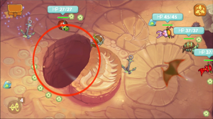
It’s tough to tell with a quick glance exactly what’s what, and at first you may end up– as I did– flinging your squid into the circled pit due to the misguided perception that it was a rock. Situations like this arise often when you don’t pay deliberate mind to decoding the terrain, and this example helps illustrate the underlying point that not all levels feel as easily-readable as the gameplay may like them to be. You can still play them more or less without issue, but this lack of visual depth erases the chance for the levels to feel distinct within themselves, and instead makes them feel flat. The point is not that it’s impossible to distinguish terrain– no, the point is that it takes an extra second or two to do so when a stronger visual presentation could have eliminated that hiccup.
The core of what’s available in Squids Odyssey is impressive. The game shows an admirable knowledge of level-design, and that knowledge– coupled with the choice to use skill-based controls– makes for a continually interesting and varied experience, despite its simplistic outward appearance. Even the game’s characters, though shallow beings living in a simple world, manage to stick out from one another just enough to let you keep track of a story to which you would otherwise pay no mind.
Unfortunately, an unignorable amount of mildly annoying technical issues paired with an art style that leaves too many levels without a sense of visual contrast means it would be hard to call the game “complete”. It’s clear from what’s available that The Game Bakers know an exceptional amount about making the core of an excellent game, but that oh-so-necessary final layer of polish is missing from Squids Odyssey.
Strategy buffs rejoice, because the Wii U eShop has received its first genuinely fun and interesting turn-based strategy affair. Squids Odyssey, though not perfect, will dish out plenty of brain-tickling situations for you to fight your way out of, and those who are in the mood for strategizing should check it out.
If you’re put off tremendously by a lack of final polish or the aesthetic you see above, then perhaps the game should be avoided. Otherwise, give it some consideration: It’s a solid game with some notable cracks.
Want to participate in more NintendoEverything goodness?
Try our Facebook page!
Or our Twitter page!
