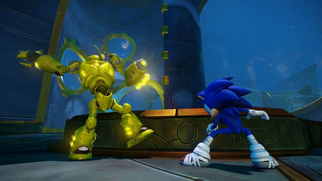
While speaking Kotaku, Big Red Button’s CEO and creative director Bob Rafe touched on Sonic’s new look, the public reaction, and what the character means to the studio. Head past the break for a roundup of Rafe’s comments.
On Sonic’s new look…
“We wanted the characters to feel a little bit older. From a character design perspective, that kind of subtle detail is really important to make the character just feel somewhat different. So, their costume approach…that was something that was collaborated with Sonic team in terms of trying a lot of different routes and the one that you see now is the one that everybody gravitated towards. The wraps are there because it shows that the characters are not vain. They’re not so much concerned about their gear, like, for example, Dr. Eggman, who is more of the vain, militaristic-looking guy who wants to have all the pomp and pageantry of that outfit. But they’re heroes who, like you see with fighters, with martial artists, or football players who wrap their cleats out of necessity…that was where that came from. That kind of sensibility of these heroes who don’t care about their attire, they’re just trying to do the thing that they need to do to get through to the action and then their goal.
“The bandana reflects the sense of character adventure. It reflects back on the lone gunman, the cowboy, the rugged individualist. As we were trying to find things that could work for the character, that was one of the things that stuck and we liked it. The rest of Sega felt the same way. So because it reflects that sense of adventure and heroism, we felt it was a good fit.
“We did a lot of experiments. The Sonic team really gave us the guardrails to experiment within. We eventually found out some of the things that were excessive and ultimately would not have been true to the spirit of what Sonic is. And I’m glad that they actually reigned us in. From an independent developer’s perspective and looking at it through the eyes of my kids who, if they were looking at a Sonic title for the first time, what would they want to see? That was something that really just drove the decision-making process from a production/design perspective.”
On the reaction…
“It was, the majority, overwhelmingly positive. So I think it validates what we’re trying to do. From my perspective, if there wasn’t such controversy, or potentially conversation about it, I should say, then we would not have been doing our job. As an independent developer who has been brought into the family to try something different, if it was seen as, ‘Oh, it looks like another Sonic title,’ then I think I would’ve failed Sega, personally. So it was really important for us to try something different, to take a different approach, and we’ll see where it takes us.”
“I take it as a highest form of compliment. I wasn’t surprised so much as really starting to understand the gravity of such an iconic character and how he has a huge following. When a character’s been along for such a long time, people—fans—get that sense of ownership. We had to be true to that, we couldn’t just brush it off as developers trying to create their vision. It was a long, methodical process of working with Sonic team and Sega to end up where we are. Very happy with the look and hopefully fans will gravitate towards it.”
On what Sonic is to the development team…
“Speed. His silhouette is very strong, he’s very recognizable. He’s got a very clean graphic silhouette with his quills. We didn’t want to break that too much. We made some slight secondary quill modifications, but that’s only because he’s going so fast so it’s kind of perking up a bit more. But really that’s where that comes from. We didn’t want to make the character feel so different that he was no longer true to the DNA of it.”
