BoxBoy! director on how the project began, would consider multiplayer for a sequel, more
Nintendo Life just put up an interview with BoxBoy! director Yasuhiro Mukae. Among the topics covered include the game’s conception, multiplayer, and more.
We’ve picked out a few excerpts from the interview below. You can read up on the full Q&A here.
On how the concept for BoxBox! was conceived…
BOXBOY!’s concept began with me trying to come up with a project featuring NES or Game Boy-style retro gameplay. The project plan was officially born in July of 2011, but that simply marked the end of the original brainstorming; I didn’t formally submit it to the company as a product proposal until 2013.
On the decision process for puzzles and levels…
First, I decide what will be the main gameplay element for each world (lasers, cranes, etc.) in order to choose gameplay themes for all of the worlds.
Coming up with a single element to serve as the gameplay theme of each world allows for a structure where gamers get exposed to new elements as they keep playing, expanding the depth of BOXBOY!’s gameplay and surprising players along the way.
I also came up with a puzzle theme for each stage in a world, trying to ensure that each stage is designed so it’s easy to notice how to solve the puzzle.
For example, the first stage may offer a simple puzzle to teach gamers how to solve it. The next one offers a variation on the first stage’s solving method to help people gradually get used to the puzzle, and then the last one asks you to adapt your solving methods to match with the puzzle presented. Our aim was to keep things from feeling unfair and letting users figure out how to solve puzzles by themselves.
On challenging design decisions given limitations with the Game Boy aesthetic…
Our aim was to keep things from feeling unfair and letting users figure out how to solve puzzles by themselves.
There were two design elements that provided particular difficulties.
One was how we expressed the line art in the game.
BOXBOY! features some innovation to allow us to express evenly drawn lines within the game in an attractive fashion.
The lines always appear to be in proportion with each other, no matter whether the camera’s close-up or pulled back in the stages.
That wouldn’t appear to be anything special at first, but it took a few tricks to ensure the lines remained even-looking throughout.
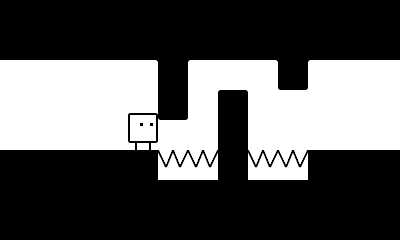
The second thing was the design, which expresses everything in black and white only.
BOXBOY! is a simple game visually, featuring monochrome graphics, so all the designs in the game had to be expressed in black and white.
We had to express both things that have physical presence and things that don’t in this world, which presented assorted challenges to the design staff.
But thanks to all of their efforts, we were able to create the unique BOXBOY! world you see in the game. I’m really satisfied with it!
On whether multiplayer was considered…
We did naturally consider the potential for a multiplayer mode for BOXBOY!
However, this is the first BOXBOY! game; it isn’t an established franchise or anything, so we decided that introducing people to the single-player fun should take priority.
If we have an opportunity to continue with BOXBOY!, I’d certainly like to think about multiplayer.
