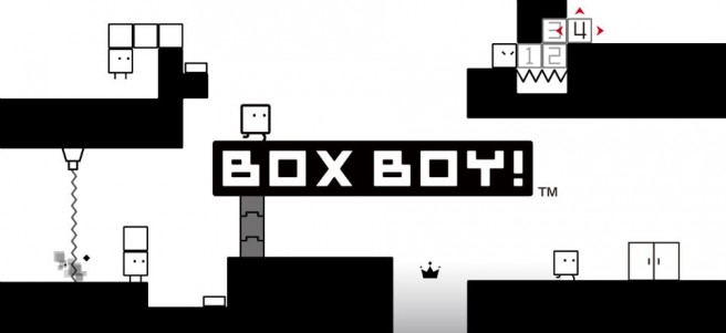
BoxBoy! team on visual style ideas, why Kirby didn’t work, development difficulties, crowns, story
In a recent issue of Famitsu, BoyBoy! director Yasuhiro Mukae, executive producer Satoshi Mitsuhara, and design lead Haruka Ito spoke about the 3DS game. There were some very interesting comments shared by the three developers, so we went ahead and translated a good portion of the interview.
Topics include:
– Different visual styles they experimented with
– Why Kirby wasn’t chosen as the main character
– An initial idea to have the obtainable crowns required to beat the game
– Development difficulties
– The story
Head past the break for our full translation!
On how the design of Qbby and game systems didn’t change much from an early design document…
Mukae: The design document was created just to make it easier to communicate the nature of the game and Qbby’s form was temporary at first. Actually, I received various drafts from designer Ito along the way.
Ito: We tried many different visual styles for the world, like having a background, 3D visuals, photographs, paintings, seals… However, we decided on the simple black and white world in the end.
Mitsuhara: To tell you the truth, there was a discussion of having Kirby as the main character during development. But Kirby can fly in the air, inhale things, and do almost anything. When thinking about compatibility with the systems of BoxBoy!, we decided on an original character.
On the collectible crowns…
Mukae: We decided on how many obtainable crowns are in the game, and at first, we thought a player would need to collect a number of those to clear the game. However, this game is well-suited for casual play and we thought that having a crown requirement could make the game look difficult. I think that having a limited number of collectible items, which are a separate thing from the normal goal, made it possible to appeal to both casuals and puzzle game enthusiasts.
On difficulties during the development…
Mukae: As you move the character, you may consider this as an action game of sorts. We thought whether to make stages puzzle or action focused until the very end [of development].
Ito: Most gimmicks in stages were designed for square shape and that shape was a restriction. For example, when a box got just barely over a spike, the box might float or look weird. Cliffs were always placed on side to avoid those problems. Designing was troublesome.
Mukae: We had to be particular about the camera position, too. It’s a trade-off between placing the camera [close] to clearly show Qbby’s outline and having a feeling of distance so that the fun of the game isn’t lost. We thought where to place the camera for the best balance and we did quite a lot of trial and error.
Mitsuhara: Although BoxBoy! looks simple, some careful planning was required to arrive in its current form.
On how events between stages were impactful…
Ito: When I first heard about the contents of the story, I was surprised like “Huh!?” (laughs).
Mukae: We didn’t intend to have a story originally but we implemented it to keep players motivated. Not much information is delivered through text, so there is room for imagination and everyone may have their own arguments.
