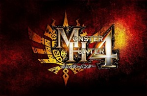
Capcom created a rather different logo for Monster Hunter 4. How’d they go about deciding on its direction? Director Kaname Fujioka gave an explanation to Dengeki in a recent interview, in which he shared the following details:
– Because of the game’s new features like verticality during fights, the team wanted to convey a sense of the changes while staying close to the core of the series
– Before Monster Hunter 4, the logos have been “tightly composed”
– Monster Hunter 4’s “M,” “H” and “4” were made larger on purpose
– This creates a larger silhouette presence to provide a sensation of depth on top of the familiar design
– “It still feels like Monster Hunter. But there’s still a sense of something new about it.”
– Whereas previous Monster Hunter logos have used colors to represent themes
– Monster Hunter 4’s theme is freedom and a sense of adventure
– Players can notice this through the story, as it’s represented using the flow of the story and the caravan
– Not forced into a single village unlike previous titles; this game has multiple villages
– This also influenced the game’s logo, along with areas in the game
– Monster Hunter 4’s first field, the ancient ruins, gives players the feeling of adventure through the immense vastness and openness of the area, in addition to the yellow grass extending into the distance
– This field of yellow and the yellow of the “Village Under the Sun,” Barubare, were incorporated into the logo along with an arrow-like sillhouette that gives the impression of release or freedom