Octopath Traveler devs on character origins, visual style, initial HD Rumble plans, much more
Ah, that was the conference where Nintendo revealed the Switch back on January 13th, 2017.
Asano: Right. We received a special invitation to debut our game at this big event, and that’s when we realized that we really had to make something that was a cut above other modern pixel games. So we got down business, and even though it took about a month and a half, we figured out the perfect way to depict our vision. And actually, that debut footage we released was really the first announcement of the game’s existence and its direction. That video ended up becoming our proof of concept, and it paved the way for the game’s future development.
Morimoto: We made this horseman boss just for the announcement. Ikushima was kind enough to draw an illustration for me and then I converted it into pixel art.
Takahashi: Yeah, and then we set that thing on fire in the battle! (Laughs)
Morimoto: If I put myself in the shoes of the consumer, and if I see a game that had exquisitely detailed boss sprites like “Final Fantasy VI” or “Romancing SaGa 3”, I would totally want to play that game! That’s the thought process that got me eager to make something really great. It took a little longer than expected to make that boss, but I think it ended up becoming something very special, something worth seeing.
Takahashi: This was the foundation for all of the bosses in “Octopath Traveler”.
Asano: We set extremely high quality standards for the bosses, in particular. We decided that they would be the principle guideline for the rest of the art. Morimoto was also in charge of the characters, and the pixel art for the regular enemies was generally delegated to our partners at Acquire and their development team.
In regards to characters, the lead character in the party always carries a lantern when the party is traversing a cave or a dungeon. Why did you choose to do have the lantern?
Asano: Back in the day, it wasn’t even conceivable to have a moving light source in pixel games. We knew if we could do that, it would look like nothing anyone has seen before.
Why did you choose to have objects in the foreground gradually become unfocused as the character moves further into the background?
Takahashi: That’s just one way of depicting the style we’re going for.
Asano: We often had debates regarding how we wanted to stylize the environment – the forests, in particular. It’s quite difficult to portray being in the woods with pixel art characters because of their proportions. In “Final Fantasy V”, for example, there was this small circumference of view around your characters when they were in a forest. We took some inspiration from that concept.
Why did you forego the use of pre-rendered videos in “Octopath Traveler”?
Asano: We actually had that in the budget for the game originally, but the real charm of “Octopath Traveler” lies in its unique art style we’ve crafted. That’s the same reason that game’s title screen has real-time gameplay behind the logo: we wanted to showcase this game’s unique look by having the main characters traversing the environments.
Let’s talk about the writing process and how you created all the characters, starting with Olberic and Primrose.
Takahashi: Olberic is actually the very first character we came up with. He was initially written as a knight in the lead imperial guard in charge of protecting the king. As you can tell, his character stayed true all the way into the final version.
Ikushima: We gave him a temporary name of “Rudolf” back when he was first created. We wrote his personality as a knight that carries many burdens, which we kept in the final version.
Asano: It was very important to us to come up with believable, down-to-earth characters that were written appropriately for the established world of “Octopath Traveler”. If you build characters and a world that doesn’t have anything persuasive or relatable about it, then I don’t think the story will end up engaging the player, and they ultimately won’t end up enjoying their experience.
Takahashi: The world of “Octopath Traveler” is similar to a Middle Ages, 15th century Europe kind of setting. We do have a few fictional aspects like magic, but other than that, we wanted to write stories and struggles that wouldn’t be uncommon for people in this kind of time period. We also kept this in mind from a design perspective to ensure things like people wearing period-appropriate clothing, environments having appropriate raw materials in it, and colors in the surroundings fitting the aesthetic, too. It might sound a little plain, but we’re confident it establishes a living, breathing world and a sense of reality to the player.
Asano: I want to point out how pixel art games back in the day often had characters with green hair or some other use of bright, vivid colors. We wanted “Octopath Traveler” to be different, though. Morimoto was in charge of converting the characters from hand-drawn art to pixels; it was very important and she did a great job on it.
How did you go about getting things done, Morimoto?
Morimoto: I put my heart and soul into making pixel art characters that could stand with the incredible ones from the past that inspired us, like those from “Final Fantasy VI” and the “SaGa” series. Those games have characters with very flamboyant colors, and that’s part of their beauty, but we didn’t want to go that direction with “Octopath Traveler”. At the same time, I didn’t want ours to look less appealing by comparison just because we chose a different aesthetic.
Takahashi: Moving on to Primrose, she was around for a long time like Olberic. The setting for her story is definitely an oddity, and we tried out a ton of different scenarios with her.
Ikushima: We originally imagined her as a female soldier named “Shannon”.
Asano: And in that sense, Helgenish (the boss of Primrose’s first chapter) was also around for a long time. We had actually created him before some of the other main characters! (Laughs)
When we reached the boss battle with Helgenish, we were shocked at the size of him!
Asano: I said “believable” and “down-to-earth” just a minute ago, but I’m very happy with how those boss sprites came out.
Takahashi: We started off making several bosses like that and as we went along, we realized how perfectly those designs fit in. After reflecting on it, we as a team realized that these over-the-top designs are what we think about when we think of bosses in a pixel art, turn-based RPG. After the first demo came out, we had a lot of fans react to them with comments like, “This is way too big! But I absolutely love it!” I’m really happy we made fans feel the same way that we did during development.
Could you tell us about other characters such as Tressa?
Asano: Morimoto did really amazing work on H’aanit and Tressa. Initially, the color of their clothes were different between their character art and their pixel art.
Ikushima: We had Tressa in white clothing, but just before we turned in our final draft, we experimented with colors like orange and yellow. When interpreting her design to pixel art, we switched the color of the feather in her cap with the color of her clothing; once we did this, we realized that putting her character-designated color on a larger surface area like her clothing gave her a stronger, more distinct look.
Did you illustrate the character art while keeping in mind that these would be adapted to pixel art?
Ikushima: There were, of course, several aspects I stayed aware of when designing the characters, such as choosing colors and their outlines. In terms of being adapted to pixel art, Morimoto and I discussed it beforehand and she didn’t want to give me any restrictions. She told me just to make the best designs I could for her, so I did.
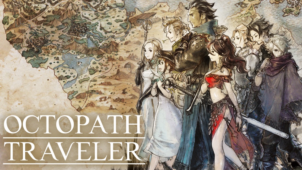
Morimoto: I did suggest to him to assign specific colors to each character, though. That’s because I think it helps to highlight each character’s individuality even after they’ve been converted to little sprites in the game. I think there’s also a nice visual sense of unity when you line all eight of them up, too.
Asano: I told Ikushima not to bother thinking about how the characters would be turned into pixel art, and I told Morimoto to make their pixel forms radiate with beauty! (laughs)