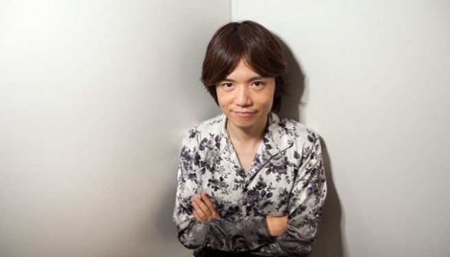
Sakurai on the topic of presentations, including Smash Bros. Ultimate’s E3 reveal
Super Smash Bros. director Masahiro Sakurai has posted a new column in this week’s issue of Famitsu. Sakurai goes in-depth on the topic of presentations, and discusses how he went about the (roughly) 20-minute reveal of Super Smash Bros. Ultimate at E3.
He shares some tidbits as well, including the fact that Digital Frontier worked on CG. The design document for Smash Bros. Ultimate is also 200 pages long.
Here’s our full translation of the column:
This week’s topic is “Presentations.” When you have an idea, you can’t implement it without being able to convey it to somebody else – say, a partner on a project. You can’t just directly connect with somebody through something like telepathy or a cable. It’s difficult! So, to “present” something is to help people understand your idea.
For example, Smash Bros. – particularly before release – is the kind of game that has a dense presentation. The reveal video at E3 was about 20 minutes or so; I wrote the script for it, of course. There really wasn’t anything special about its production, writing the script would eventually boil down to this:
- Write out the video’s elements in bullet points.
- Separate everything into segments.
- Write everything out in sentences.
- Edit according to what I wanted to accomplish.
To put it simply, I tried to work from larger concepts to smaller ones. After that, the teams in Kyoto and Tokyo worked on their respective parts, we shot the live-action segment, and Nintendo took care of the editing.
In Smash Bros.’ case in particular, though, that wasn’t it – we had to record segments of the characters fighting as well. We wanted to put a lot of work into this part specifically, so the viewers could enjoy it.
A CG company called Digital Frontier produced the CG parts themselves; though, we couldn’t subcontract them to do everything, of course. I wrote the “plot” first and would check in every so often after we had handed production off to them.
It takes a lot of different people to make a presentation like this come together, you know! Yeah, quite a few. Even for a game director, it’s a considerable number of tasks to undertake; development is pretty serious. Half the role is acting as a producer!
Even still, presentation is essential. Typically, we’d leave that to the public relations team, and I’d continue to supervise things here and there – yet, I’ve found that how we did things this time around worked best.
When it comes to games though, simply making them just isn’t enough. A game’s content and its publicizing magnify each other: even a good game can be nothing if people don’t know about it.
To that end, presentation relies on “tempo,” in a way – it can’t be something in which information trickles out slowly. However! Tempo isn’t the speed of the presentation, either. If it takes a bit of time for the presentation to get around to the info, that isn’t necessarily a bad thing!
The real question is: how do you maintain interest without fans becoming bored? I think that’s something one really has to take into consideration. If a presentation is entertaining and can maintain the viewers’ interest, it can be long; but if it isn’t those things it won’t be good even if it’s short!
In Smash Bros. Ultimate’s case, the number of game elements directly correlated to the amount of information we had to share. A lot of work went into the game, so of course there were a mountain of things I’d liked to have shared, but in the end, I needed to be straightforward and trim off all the unnecessary tidbits. In reality, the number of hours that went into each individual fighter is immeasurable, so there’s a level of attachment to all of them. Even so, each character’s introduction was only but a few seconds! To that end, I considered what might be interesting to the viewer, and balanced things out.
For instance, when working on a game’s design document it’s best to be as concise as possible, right? That’s important! The goal isn’t to just reduce the number of sentences though, it’s more about whether it reads easily and interestingly or not.
To be honest, Smash Bros. Ultimate’s design document is somewhere over 200 pages! Only looking at it, you’d think, “wow, this is pretty dense!” But if you read through it you’d find that each page’s heading is only one sentence; there’s more of an emphasis on drawings and photos, so you’d be able to get through it pretty quickly. During the actual presentation, each fighter had a brief explanation about their abilities, but nothing more than that. During production I based everybody’s instructions off of the desire for them to be easy enough to understand that anybody would be able to parrot them back.
Presentation is the relationship between tempo and interest! If you ingrain that principle into your head, you’ll naturally be able to cut out pointless things! So, if you have to make some kind of presentation, check yourself!!
Translation by provided by Nico Thaxton on behalf of Nintendo Everything
If you use any of this translation, please be sure to source Nintendo Everything. Do not copy its full contents.
