Analyzing the art style of every Smash Bros. game
It’s been many years since the original release of Super Smash Bros. Ultimate in 2018. There’s been no official announcement for a new game at the time of writing, but the wait between Ultimate and its eventual sequel is already setting a record. Indeed, the time between new Smash Bros. games has never been greater. But that leaves us with plenty of time to appreciate the titles we already have, and one aspect of them that often goes undiscussed is their art styles.
Despite being fairly similar to each other on a gameplay level, each Super Smash Bros. game winds up feeling distinct because of its art style. 64, Melee, Brawl, 3DS, Wii U, and Ultimate are all visually distinct from one another, and this is a trend we can expect to see when the next entry eventually does come out. In the meantime, today we’re analyzing the individual art style of each entry in the series and going over what makes each one charming.
Super Smash Bros.
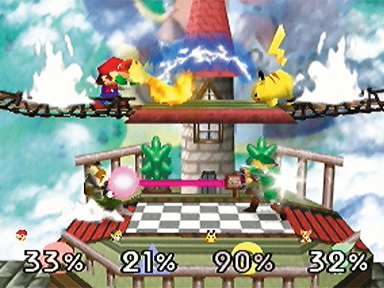
It’s no secret that in some cases, Nintendo 64 games don’t age very well – and this is mostly in terms of the visuals department. In fact, you could argue that many SNES games have aged better than Nintendo 64 games despite being older, and there’s definitely some truth to that. The console’s polygonal look often makes it look more primitive than the hand-drawn sprite art on SNES. Don’t get us wrong, though – there’s definitely a certain charm to the N64’s jagged edges. The original Super Smash Bros. actually wound up taking advantage of the console’s limitations. The twelve characters present in the game are not supposed to be the characters themselves, but rather dolls representing them instead. You can see this in the intro cutscene – Master Hand places the limp dolls on a battlefield and then brings them to life. This is where the N64’s polygonal limitations come into play. Since the fighters’ models aren’t perfect visual matches for the characters they’re based on (Mario is really short and has spiky hair, for instance), it actually winds up creating an extra sense of immersion. These aren’t the characters themselves, but rather representations of them fighting in someone’s imagination.
Overall, the original Smash Bros. takes on an incredibly cartoony art style. It’s practically made for characters like Kirby, Pikachu, and Jigglypuff. Humanoid fighters like Link, Samus, and Captain Falcon do end up looking quite blocky, but that’s a problem that was quickly corrected for the next game. Also as a result of the N64’s limitations, many of the stages are extremely simple, consisting of only a couple platforms. Sector Z and Saffron City are probably the most visually appealing stages in the game; rather than being a set of floating platforms, they’re faithful recreations of real locations from their respective franchises.
Super Smash Bros. Melee
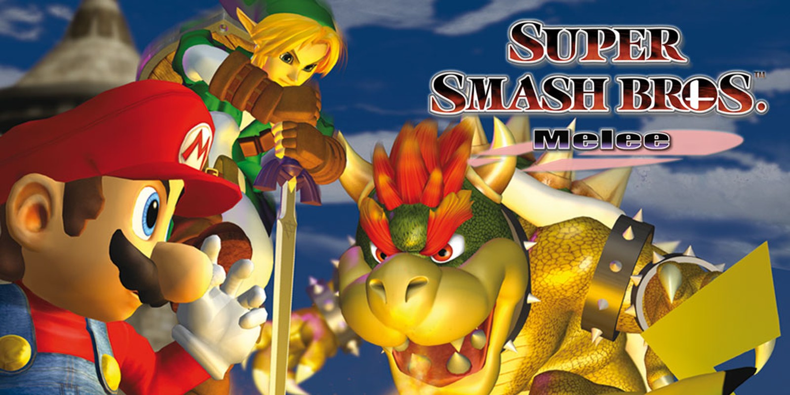
The leap in graphical quality from Super Smash Bros. on the Nintendo 64 to Super Smash Bros. Melee on the GameCube was absolutely incredible. The two games were released two years apart, but it feels like there’s a decade of graphical innovation in between. Gone are the rough edges and polygonal look of the N64 version, and what you get instead is a game with a smooth, almost futuristic look with much higher quality character and stage models. For releasing in 2001, Super Smash Bros. Melee still has a lot of charm to this day, and it’s a kind of charm that’s tough to accurately explain. For one, many of the characters don’t look quite right. You can attribute this to the game’s 2001 release date; in many cases, the fighters’ modern designs weren’t set in stone yet, so the Melee team had to take quite a few liberties. Donkey Kong’s limbs are overly long and lanky, Bowser’s colors are washed out and dark, and Yoshi especially has wonky proportions and doesn’t at all match the appearance we know him by in the modern day.
The stages are another huge upgrade. They’re all so much more detailed than anything the Nintendo 64 could produce, and while some of them are still arrangements of floating platforms, a lot of them have more natural land formations and represent their respective franchises much better. Fourside and Fountain of Dreams are some of the most visually striking stages in the game, and they’ve got great music to match. When you see the new Smash stages (Battlefield and Final Destination), you can really see that futuristic theme kick into high gear, particularly in the backgrounds. This extends to the main menu and the sound effects, too. Everything’s got a dark and neon color palette.
Super Smash Bros. Brawl
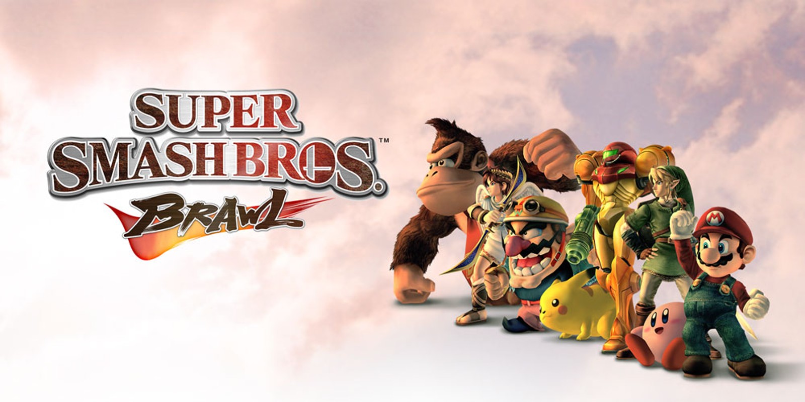
It’s hard to say whether Super Smash Bros. Brawl’s art style is an upgrade over Melee’s, but it’s definitely something distinctly different. Smash Bros. 64 had a cartoony art style, Melee had a futuristic and detailed art style, and Brawl has an extremely realistic art style. This is an interesting design choice, too. The Wii hit it big with casual players, so you would think a Smash Bros. game on the console would have adopted a cartoony art style to match. But perhaps Nintendo was trying to increase the appeal of their characters to older players by rendering them more realistically. Indeed, there are realistic details everywhere – Mario’s overalls have a ton of detail and denim patterns, Peach’s dress has all sorts of wrinkles and fabrics, and characters like Marth, Link, and Snake look right at home in this art style. On the other hand, characters like Kirby, Sonic, Pikachu, and Jigglypuff look a little bit out of place. There’s only so much you can do with them in terms of texturing and fur detail without going overboard.
The overly realistic art style also sort of contrasts with Brawl’s gameplay. Though the game does have a decent-sized competitive scene around it, it’s sometimes regarded as a less viable metagame thanks to random elements like tripping and broken elements like chain grabbing (or Meta Knight in general). The realistic art style would theoretically be more fitting for a game like Super Smash Bros. Ultimate, which in many ways was specifically designed to enhance competitive play. We also haven’t seen a realistic art style for a Smash Bros. game since Brawl. If we had to guess, we’d say the next one will continue to adopt the cartoony art style Super Smash Bros. for Wii U put back into place. That aligns more with the modern depictions of many of Nintendo’s characters.
Super Smash Bros. for Wii U / 3DS
Whereas Super Smash Bros. Brawl’s art style was realistic with washed-out colors, Super Smash Bros. for Wii U took its art style in the complete opposite direction. There are two kinds of characters in Super Smash Bros. – cartoony ones like Mario and Kirby and more realistic ones like Link or Ganondorf or Marth. Previously, the Super Smash Bros. art styles kind of alienated one of those groups. The more realistic characters looked better in Brawl, whereas the more cartoony ones looked better in the other games. In Super Smash Bros. for Wii U, both categories of fighter look good. The colors are super vibrant this time around – more vibrant than ever, in fact, even if you compare its art style to Ultimate’s.
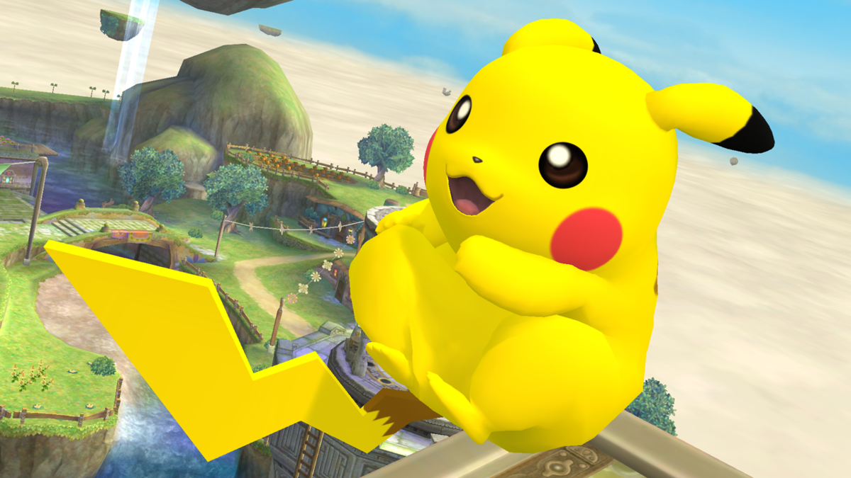
Super Smash Bros. for Nintendo 3DS has just about the same art style, but with a few key differences. The most noticeable one is the outline, which can be toggled in settings but is on by default. This is the only Smash Bros. game on a portable system that has a tiny screen, so the outlines were deemed necessary to more easily keep track of the characters. The 3DS version also seems to have generally warmer colors that aren’t quite as vibrant as the ones on Wii U. If you’ve ever seen Pikachu or Pac-Man in Super Smash Bros. for Wii U (like the image above), you’d notice how incredibly saturated they are compared to Super Smash Bros. Ultimate.
Super Smash Bros. Ultimate
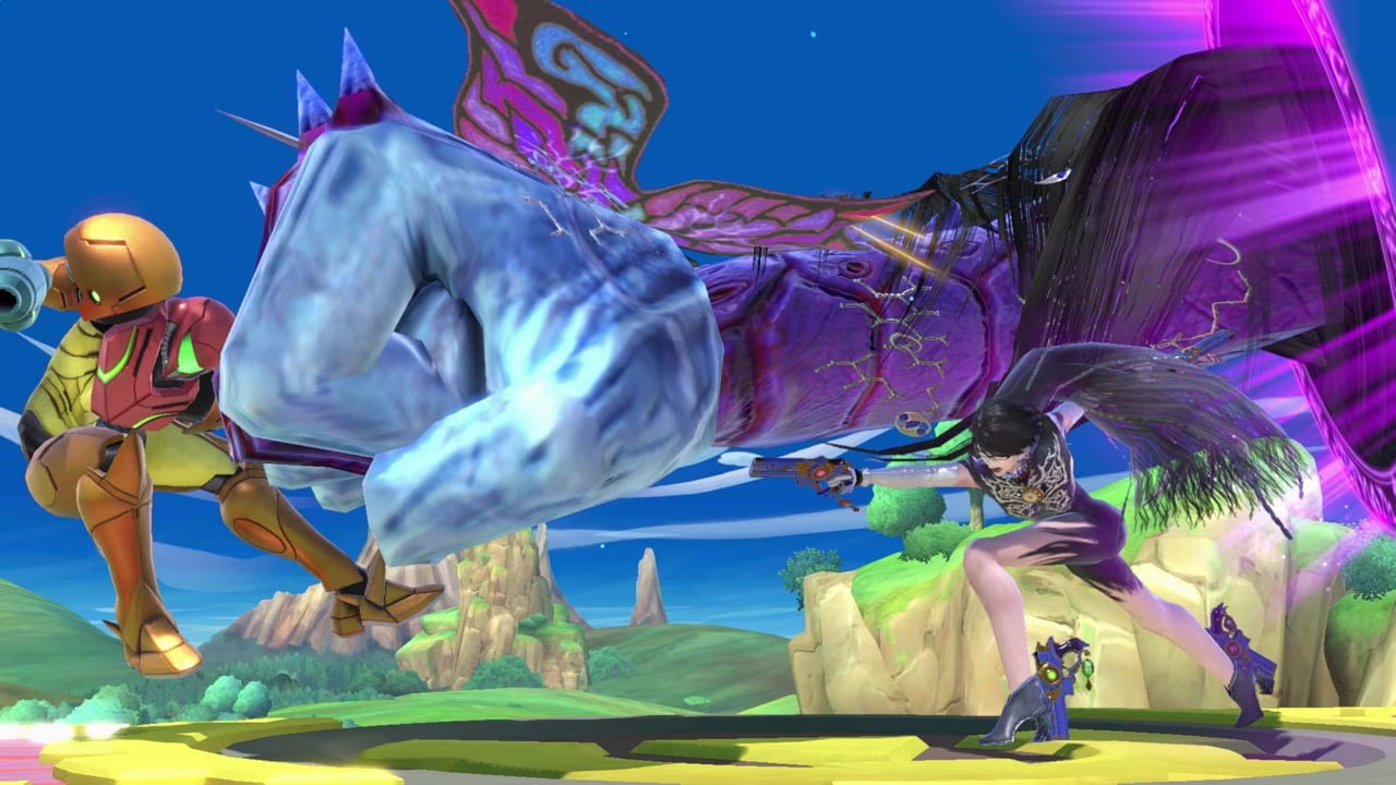
Super Smash Bros. Ultimate arguably has the most balanced art style of any Smash game. Both cartoony and realistic characters look great in its art style, which balances color better than any other game in the series. Brawl’s colors were too washed out, and Super Smash Bros. for Wii U’s colors were arguably a little bit too saturated. Ultimate strikes a fine balance between the two, and it gives a much-needed facelift to tons of returning stages from previous Smash games as well. As mentioned by director Masahiro Sakurai in an interview, Super Smash Bros. Ultimate’s main menus are inspired by Persona 5. Indeed, the main menu looks much different than anything the series has seen before. It’s got more intense colors, interesting and unique button shapes, and plenty of unique art that pops up on the side menus as you navigate through the options. In terms of both in-game graphics and menu design, Ultimate is a solid step forward for the franchise.
Which Smash game has your favorite art style? We expect most of the answers will probably be Super Smash Bros. Ultimate, given the graphics of the game are technically more advanced than in any other title. Whichever your answer is, feel free to let us know in the comments down below.