Octopath Traveler devs on character origins, visual style, initial HD Rumble plans, much more
We’re really big fans of Ophelia’s character sprite.
Asano: Morimoto worked really hard on the pleats on Ophelia’s skirt.
Morimoto: Seeing the joy on Asano’s face once the pleats were completed really left an impression on me.
Asano: Like with the pleats on Ophelia’s skirt, I was totally impressed with how she made H’aanit’s fur—it looks so soft even though it’s just pixels!
Morimoto: When creating pixel art, if you use too many colors and go too into detail, it ends up losing its aesthetic and looking like a regular design. So I limited the color scale and the number of colors I could use on a character in addition to using strong contrasts to end up with a compelling result. But under those restrictions, no matter what I did, H’aanit’s fur always ended up looking like a stiff object. So I came up with an idea, and I allowed myself to go outside of my self-imposed rules by using some different color gradients to give the fur a soft-looking quality.
Were there any characters in particular that were challenging for you?
Morimoto: Hmm… I’d have to say H’aanit. From my perspective as a designer, I really like characters with pinkish hair, so I held myself to even higher standards with her. Tressa was also a challenge. Like I said, if you try to convert an illustration to pixel art exactly, without taking some creative liberties, you just end up with a rather plain image. For example, Tressa wears a hat, right? I ended up making her hat much bigger in the pixel art than it is in her drawing for emphasis, and it ended up becoming a really recognizable part of her.
Let’s talk about the other male characters: Cyrus, Therion and Alfyn.
Takahashi: We looked at reactions online from people who played the “Octopath Traveler Prologue Demo”, and it was apparent that both Cyrus and Therion were quite popular with the ladies. Compared to other male characters, they stood out of the crowd. We drew Cyrus to be a dreamy guy, so it makes sense.
Ikushima: I was told to illustrate him as a “handsome intellectual”.
Asano: I love Cyrus’s cape! It’s so cool! I was actually worried that it wouldn’t look cool anymore after making the transition to a sprite. (Laughs)
Takahashi: When I asked Ikushima to draw him, I posed the question, “What would a regular scholar in this world look like, and what kinds of robes would they wear?” We had to answer this question first, then we could think about what kinds of robes our main character would wear. So, we actually got to work on designing the scholars first instead of Cyrus.
Ikushima: We devised that there would be many who looked like a typical academic-type—middle aged and such. But among that group there should be some beautiful, yet handsome intellectuals, right? (Laughs) We wanted scholars to be clothed in robes and to generally look the part, but we knew we wanted Cyrus and his personality to stand out by the stylish way he dresses himself. When he was converted to pixel art, they used the black undertones and gold embroidery that I illustrated in the character art really well. They even managed to fit in his robes as I designed them.
Asano: Since we wanted the characters to be down-to-earth, we didn’t want there to be some one-of-a-kind clothing that only one specific person wears. So I joined in on the discussion, “I wonder… Are these robes provided to the scholars like some kind of uniform?” And then I only went deeper asking, “Well, what do they do in their daily lives? What are their jobs?” I was going on and on with this thought process when I suddenly freaked myself out—Then I thought, “Oh god, what the hell’s our thief gonna wear?!”
Everyone: (Laughter)
Asano: Thieves are super cool and carefree, so we chose to give him a pretty original design. We thought if we were going to somehow make a “down-to-earth thief”, then perhaps he’s kind of similar to a poor person.
Ikushima: I was given complete creative freedom when creating Therion. When designing his clothing, I tried to imagine what a thief would wear that would be convenient or functional to commit theft. I also designed him to have discernible colors and outlines for when he’d be turned into a character sprite.
And last, but not least: Alfyn. Could you tell us about him?
Ikushima: I focused on making his design apparent that he lives a simple life – probably the most ordinary life out of the four main male characters. I tried to bring out his personality of being a hot-blooded guy, too. I started off in the same way as with the scholars: I gave a lot of thought to what an alchemist would wear in the world of “Octopath”, and I came up with a combination of a vest and a satchel for storing tonics.
Morimoto: On the upper half of his body alone, Alfyn’s clothes are layered with a shirt, a vest and a jacket. You only get so much space to work with in pixel art, so I certainly had my work cut out for me. Not to mention he also has his satchel there overcrowding things. Once I was able to fit everything into his character sprite, not only was I satisfied with how good he looked, I really felt a sense of achievement in being able to make his design work in sprite form.
Ikushima: In regards to his hairstyle, I initially designed him with straight hair, but people of European descent have many different hair qualities. Some guys have unruly hair that they tie back in a messy, yet masculine way. We thought that would fit Alfyn’s character.
Morimoto: I think we did an excellent job reproducing that effect with his hairstyle. We also have a pose where he’s holding a mortar and pestle and making medicine. I was really pleased with how that one came out because so much is going on in such a tiny space. There are others among the men in the group who are humble like Alfyn is, so I had a good time making his actions and movements showcase him as the most lively and excitable member.
What ideas did you have in mind when illustrating this piece?
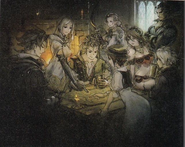
Ikushima: Asano requested me to create a photo of all eight characters with a map as the main theme. He told me that it would become the first image that we would release of all the main characters together. I first started by thinking to myself about where people would meet during this era, and I naturally came to the conclusion that they would gather at a tavern. A tavern is not only a place where people come to relieve stress, but also a place where information gets exchanged. So I drew the main characters in the middle of their journey, taking a breather with a few drinks and discussing where to go next over the main theme: the map. I wanted to keep the atmosphere fairly adult, so I chose darker colors in order to convey the mood.
It looks like Olberic is standing in the back, just watching.
Ikushima: Yeah, I was really keen on expressing each character’s personality through their respective body language. I really dwelled on these aspects for a while before I became satisfied with them—to be honest, it suddenly came to me out of nowhere how to draw each character’s behavior, and then I was hammering them out without much of a problem. It was as if I wasn’t completely comfortable being around them but in the end, we suddenly became friends! (Laughs)
What did the rest of you think upon seeing this completed piece for the first time?
Takahashi: Hmm, well, at the time that Ikushima was drawing this, we in the team were discussing among ourselves regarding what kind of image this should be—it was going to be the first one we showed off to the world, after all. We definitely had a lot of strong and differing opinions when we gave suggestions. Plenty of games have already done the thing where all the characters are lined up and facing forward with an introduction about each of them, so we knew we wanted to avoid that style. We always stayed aware that this would be a game that’s grounded in reality, so we knew that ultimately we wanted an image that showed them interacting in a really natural way, but also in a way that conveyed their personalities clearly to the audience. We racked our brains over and over trying to figure out an enjoyable situation where all of these aspects could be conveyed to the viewer. And so once we saw what Ikushima made, we all thought, “This is totally it!”
Asano: As Takahashi said, the first illustration that gets shown off to the public is often where the characters a facing forward and such, but it doesn’t have to be that way. We wanted our first image we show the world to be like a natural scenario that you’d find yourself in during the game.
Ikushima: Yeah, we didn’t want the characters just to be in some kind of cliché pose. So I drew this as if it’s just a simple scene from our characters’ journey. And this is just my opinion, but I think the image also looks like you’re seeing it from the viewpoint of the ninth traveler who’s approaching the table: you, the player! This photo also has an intimate viewpoint with all the characters close together, when compared with our other art. It’s as if the image is saying to you, “Alright! It’s time to go on an adventure with these guys!”

