Bayonetta 2’s conceptual design highlighted in new PlatinumGames blog post
Posted on December 20, 2014 by Brian(@NE_Brian) in News, Wii U
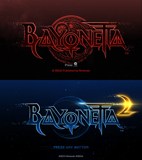
PlatinumGames updated its official blog yet again with another post about Bayonetta 2. This time around, we get to hear about the game’s conceptual design.
Check out a few excerpts below:
As you can see, the base tones for the original Bayonetta were red and black, whereas in Bayonetta 2 they’re blue (representing Bayonetta) and gold (representing the game’s enemies). Compared to the image above it, you can tell the bottom screen gives off a much brighter, vivid impression.
What was so difficult about this was that while Bayonetta’s key color was blue, the key color for Aesir’s power was blue as well. Ultimately we resolved this issue by changing this mysterious power of Aesir’s to an emerald green, but it’s still kind of hard for players to discern, so I gave Aesir his own unique line patterns in his design to draw distinction from Bayonetta.
Head on over to the PlatinumGames website for the full post.