Lead architect for NES and SNES Masayuki Uemura has passed away
Posted on 4 years ago by Ervin in General Nintendo, News | 0 comments
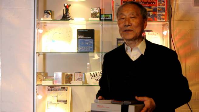
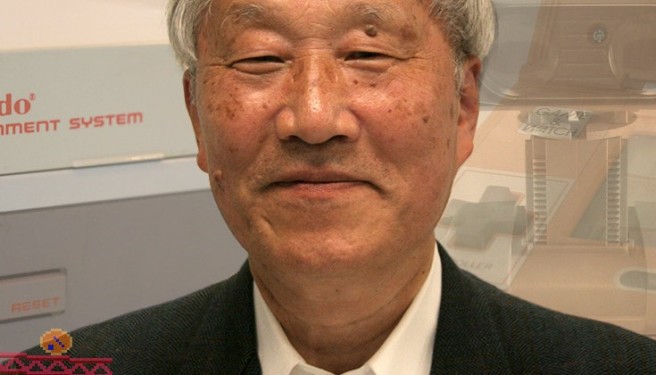
According to information from documentarian team Archipel, NES and SNES lead architect Masayuki Uemara has passed away at the age of 78.
More: Masayuki Uemura
NES designer reconfirms original color scheme was based on Nintendo president’s favorite scarf
Posted on 10 years ago by Brian(@NE_Brian) in General Nintendo, News | 3 Comments
Engineer and designer Masayuki Uemura, who worked on the creation of the NES, recently appeared at the National Videogame Arcade in Hockley. Nottingham Post caught up with him for a brief chat about the famous console.
According to Uemura, the console’s original color scheme was based on Hiroshi Yamauchi’s favorite scarf. Of course, Yamauchi was Nintendo’s president at the time.
Uemura also said the following when we asked if he believes games helped build East-West relations in the wake of World War II:
“The NES had an important role in transmitting Japanese culture to the world, and we received influences from foreign countries, too. We are different cultures but childhood is universal.”
More: Masayuki Uemura, top
NES designer on Nintendo and Sony’s failed partnership, emphasis on design, indie comparison
Posted on 10 years ago by Brian(@NE_Brian) in General Nintendo, News | 12 Comments
Back in the day, Nintendo and Sony once attempted to work with each other. The SNES PlayStation prototype is evidence of that. Had the two sides collaborated, Sony would have come out with its own SNES-CD peripheral for the console.
NES designer Masayuki Uemura, in an interview with Gamasutra, spoke about Nintendo and Sony’s failed partnership during a NES celebration at The Strong Museum of Play’s International Center for the History of Electronic Games. Whereas companies like Sony began to focus on graphics and the technological side of gaming at the time, Nintendo still pushed for innovation with design.
Uemura said:
“You might know that we tried to collaborate with Sony once. We knew what Sony was thinking and what kinds of things they were trying to develop. During this time when Sony and other companies started launching products, people started realizing how difficult it is to create a game with great mechanics. Since the time of Game & Watch, Nintendo was doing their best to create game design mechanics that fully utilize the limited technological specifications. What happened was when they started launching those products with high quality graphic design they started emphasizing the graphics processing power – in other words, it wasn’t just the game mechanics they had to focus on but they also had to focus on graphic expression and sound design, not just game design. That’s how the market got saturated with all these kinds of products.
“By contrast, Nintendo was always trying to push the limitations of new types of play. That was a difference between Nintendo product lines and the others. With the maturity of the game industry…it was time to start thinking about redefining the importance of mechanics and design. So for a couple decades the game publishers and hardware manufacturers were focusing on graphics processing power and sound effects and so forth and not focusing much on innovating in game design and mechanics.”
More: interview, Masayuki Uemura, Sony, top
NES designer talks about the controller
Posted on 10 years ago by Brian(@NE_Brian) in General Nintendo, News | 2 Comments
NES designer Masayuki Uemura has offered quite a bit of insight into the console’s controller. Here’s what was shared with USgamer:
“There were, as you can probably imagine, a lot of difficulties we faced in doing things for the first time in building this hardware, but one of the most difficult was, ‘What shape and layout will the controller have?’ This has a touch of coincidence about it, too, but some of those people who had gone to work with Gunpei Yokoi’s team eventually found their way back to our team. So one of the ideas that came up because of that was, ‘Well, we’ve got this Game & Watch multi-screen Donkey Kong that uses the controller format of a plus control pad and buttons.’ So we hooked that up and got it working.”
“At the time, we were prototyping various ideas for the Famicom hardware, as well as controllers. When we took this idea that had been used for controls with the Donkey Kong Game & Watch and got it working on the Famicom prototype with that same style of controls, we immediately knew, ‘OK, this feels right; there’s something good about this.’ That means that there are actually a few people who can claim that they invented the controller for the Famicom!
“I think that the biggest reason that we liked the controls this way was just how good the original Game & Watch Donkey Kong, which was on multi-screen, felt. To expand on that a little further, with this prototype… the multi-screen format of the Donkey Kong Game & Watch means that you have a screen on top and a screen on the bottom, with the controls down below. When we hooked up the prototype, it meant that you were no longer looking down there [at the controls], but up here [at the screen]. Yet we suddenly realized, kind of mysteriously, that you didn’t need to look at the controls while you were playing the game, and it still felt right!
“And up to that point, we had tried a big variety of control styles and they had all had some sort of something that didn’t feel quite right about them, but this was something that no matter who tried it on our team, they could tell right away that this worked. So that’s when I decided to put my foot down and make the call that this is what we would be going with.
“I may have made the decision, but in the end, it’s something that whoever worked on the Game & Watch for Donkey Kong had a hand in, whoever brought the idea to try out the prototype had a hand in it—it was really a team effort.”
“You know, we didn’t patent that technology (crosspad design) at the time. Once it was established, you kind of started to see it pop up everywhere, and now it’s kind of become a standard for controls in games.”
USgamer has much more with Uemura in its piece. You can read up on the full article here.
More: interview, Masayuki Uemura, top
NES designer on the system’s name, setting itself apart from Atari, and success
Posted on 10 years ago by Brian(@NE_Brian) in General Nintendo, News | 4 Comments
Mashable recently had a chance to speak with Masayuki Uemura, the lead designer of the Nintendo Entertainment System.
At one point during the discussion, Uemura commented on how the name was settled on:
“We decided to put Entertainment in the middle. We thought we could maybe piggyback a little bit [on] the naming idea Atari had had, but put something with a little more dynamism and attraction in the middle. So that’s how it became the NES.”
Masayuki went on to discuss Atari – which had created a negative images of games – and how Nintendo wanted to go in a different direction.
More: interview, Masayuki Uemura, nes, top
NES designer explains the front-loading slot, why the Zapper was bundled in
Posted on 10 years ago by Brian(@NE_Brian) in General Nintendo, News | 9 Comments
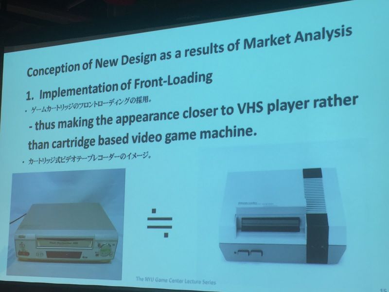
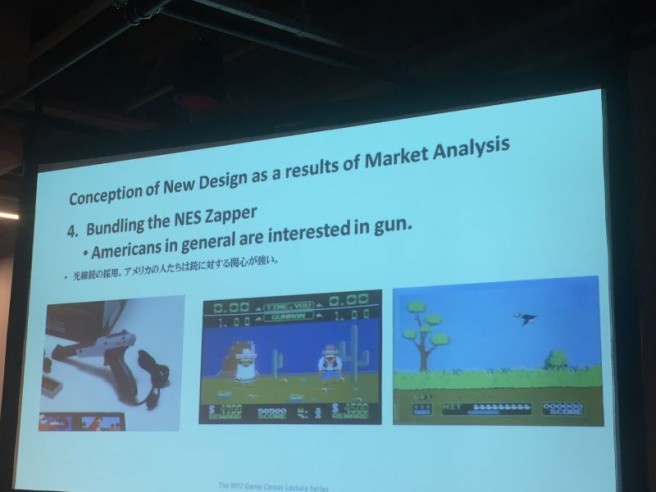
Masayuki Uemura, a lead designer of the Nintendo Entertainment System, held a presentation at New York University’s Game Center last night. Uemura shared a couple of interesting insights that I wanted to relay here.
First, the front-loading slot was implemented since VHS systems were popular in the mid-190s. The team wanted to make the NES to take on a somewhat similar appearance. Uemura also commented on why the Zapper was bundled in: because Americans loved guns, apparently!
