Code Name: S.T.E.A.M. dev toned down the American comic book-styled visuals
Posted on 8 years ago by Brian(@NE_Brian) in 3DS, News | 4 Comments
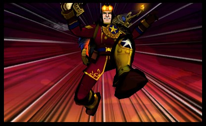
In this month’s issue of Japanese magazine Nintendo Dream, Code Name: S.T.E.A.M. art director Takako Sakai opened up on the game’s art style and visuals as a whole.
According to Sakai, he wanted there to be as few differences as possible between the 2D illustrations and in-game 3D models.
Sakai began by creating character illustrations that imitated the feel of American comics from 1960 since he felt that was nicely compatible with polygons. However, this style was also chosen since he personally liked it.
Next, Sakai shares the following about why and how the art style in Code Name: S.T.E.A.M. changed a bit:
Code Name: S.T.E.A.M. art director on how the game’s visuals changed during development
Posted on 9 years ago by Brian(@NE_Brian) in 3DS, News | 1 Comment
It took some time for Intelligent Systems to settle on the visuals for Code Name: S.T.E.A.M. Speaking with USgamer, art director Takako Sakai explained how the style changed throughout development.
Originally, the team wanted to “recreate the same pen touch” found in American comic art. But “some visual elements made the game a little bit harder to play”, which led Intelligent Systems to make “some light revisions” – resulting in the graphics we see in the final code.
Sakai’s full comments are as follows:
When we set out to recreate the feeling of [American] comic art, and tried to recreate the same pen touch—that kind of feeling to the actual stroke… We noticed that some visual elements made the game a little bit harder to play. So we made some light revisions there, and landed on the style you see in [S.T.E.A.M.] now. At first, we [created] a color palette that was really faithful to the printing technology of the time. But once implemented, we found that it did make the game a little bit hard to play in some situations. So we made adjustments as appropriate—as little as possible—as we went. And where we ended, you’ll notice the enemies have sort of a colder, bluer palette to them, whereas your allies have a warmer palette—a lot of orange and red.”