Zelda: Tears of the Kingdom devs talk early Depths ideas
Posted on 1 year ago by Brian(@NE_Brian) in News, Switch | 0 comments
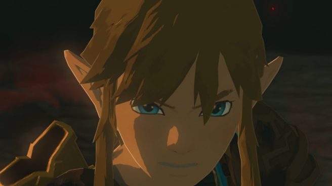
The developers behind The Legend of Zelda: Tears of the Kingdom have shared interesting details about the early days of making the Depths. This comes from the new art book that just came out in Japan.
The Depths are one major area of the game alongside the sky and Hyrule itself. However, things didn’t come together immediately. Art director Satoru Takizawa seemed to initially have an idea in his head about “a Cretaceous Period-like world with dinosaurs or the mythical underworld.” The team did actually make an experiment based on this. Director Hidemaro Fujibayashi also indicated that the team played around with the brightness, noting that “there was a considerable amount of trial and error” before the final level of darkness was decided.
Kakariko Village and Korok Forest swapped locations while Zelda: Breath of the Wild was in development
Posted on 6 years ago by Brian(@NE_Brian) in News, Switch | 0 comments
Rarely do games stay the same throughout development. One example of this pertains to Zelda: Breath of the Wild, specifically involving two locations.
In an interview published on Nintendo’s website this week, developer Manabu Takehara revealed that Kakariko Village and Korok Forest ended up swapping locations. He felt that “the two locations were out of place” as the game started to come together, so having them switch made the most sense.
Takehara said:
Zelda: Breath of the Wild devs scrapped idea of stabbing and resting on weapons following Miyamoto feedback
Posted on 8 years ago by Brian(@NE_Brian) in News, Switch, Wii U | 71 Comments
Not every idea made it into The Legend of Zelda: Breath of the Wild. For instance, Nintendo considered including tiny people as well as the Hookshot and Beetle items.
Art director Satoru Takizawa and director Hidemaro Fujibayashi revealed another cut idea while speaking with GameSpot. At one point, players would be able to stab their weapon into a wall. Doing so would let Link recover stamina.
Midway through development, the team decided against including the mechanic. This was in large part due to feedback from Shigeru Miyamoto, who essentially vetoed the idea due to it being illogical. The developers thought about stabbing weapons into cracks or crevices, though that wouldn’t work either since you’d be limited in where it could be done.
Takizawa and Fujibayashi said:
Zelda: Breath of the Wild devs on starting out with 10 people, showing Miyamoto the 2D prototype, Great Plateau made first, more
Posted on 8 years ago by Brian(@NE_Brian) in News, Switch, Wii U | 4 Comments
IGN caught up with Zelda: Breath of the Wild director Hidemaro Fujibayashi, technical director Takuhiro Dohta, and art director Satoru Takizawa to discuss the game’s creation in greater depth. Some interesting comments were shared about the game’s development. Fujibayashi, Dohta, and Takizawa talked about starting out with a small team, the 2D prototype, making The Great Plateau first, and more.
You can find a summary we’ve done below. For the full piece, head on over to IGN here.
Zelda: Breath of the Wild art director on how The Wind Waker HD shaped the game’s art style
Posted on 8 years ago by Brian(@NE_Brian) in News, Switch, Wii U | 7 Comments
As you can probably tell, The Legend of Zelda: The Wind Waker HD served as a big inspiration for the art style in Breath of the Wild. This goes all the way back to when Nintendo was working on the Wii U remaster a few years ago. Breath of the Wild art director Satoru Takizawa spoke about how the game’s style was determined during a session at GDC last week.
When looking to see how different Zelda games would look like in HD, Nintendo took models from previous games and placed them into a development environment to try different mockups. Skyward Sword, Twilight Princess, and The Wind Waker were all tested. Wind Waker “stood out” the most “and really captured the imagination of the lead artists on Breath of the Wild”. The team took it from there.
While Wind Waker would end up being used as inspiration, the art style couldn’t be carried over completely. The cartoonish direction couldn’t allow for a certain sense of realism that the team wanted to achieve. Additionally, there was some concern about it being a turnoff for older players.
Breath of the Wild’s final look was ultimately determined based on a slogan Nintendo decided on, which is “refreshing and full-flavored.”
Here’s the full explanation on how the game’s art style came to be from Takizawa:
Zelda: Breath of the Wild team on dev approach, difficulty, speedrunners, concept art, Shrines, bugs, and more
Posted on 8 years ago by Brian(@NE_Brian) in News, Switch, Wii U | 9 Comments
The Verge recently chatted with Zelda: Breath of the Wild director Hidemaro Fujibayashi, art director Satoru Takizawa, and technical director Takuhiro Dohta. Tons of topics were discussed in the new interview. Among them include how the team approached development, the game’s difficulty, speedrunning, the crazy concept, designing Shrines, and making the experience as bug free as possible.
We’ve rounded up notable excerpts from the interview below. You can read the full discussion on The Verge here.
Art director says Link’s iconic hat is missing in Zelda: Breath of the Wild since it’s tough to make it look cool
Posted on 8 years ago by Brian(@NE_Brian) in News, Switch, Wii U | 68 Comments
The Legend of Zelda: Breath of the Wild breaks many of the series’ conventions. Among these is the lack of Link’s iconic hat, which has long been a staple of the series.
In an interview with Polygon, Breath of the Wild art director Satoru Takizawa told Polygon that due to the rise of graphic fidelity, it’s tough “to make that hat look cool.”
He said:
“As the graphic fidelity has increased it becomes more difficult to make that hat look cool. As the game becomes more realistic it’s difficult to present it in a way that’s appealing.
If you look at Twilight Princess, I really made the hat long, so it would flap in the wind and move around. But because of that people were like ‘What’s he got? What’s in that hat?’ We’re reaching our limits as to how we can make it look cool.”
Takizawa added that with Skyward Sword, he attempted to make Link’s hat diminutive and giving it much less motion, but “we’re reaching our limits as to how we can make it look cool.”
Zelda: Breath of the Wild’s map is based on Kyoto
Posted on 8 years ago by Brian(@NE_Brian) in News, Switch, Wii U | 0 comments
The Legend of Zelda: Breath of the Wild’s huge map is based on Kyoto, Japan. That’s according to director Hidemaro Fujibayashi, who revealed the information while speaking with The Verge.
Fujibayashi told the site:
“When I first started looking at this game, I had Link in an empty game field and I would just walk around and try to map out and get a feel for the distance and where landmarks should be. What helped me with this was my hometown, Kyoto. I took a map of Kyoto and overlaid it on the game world, and I tried to imagine going to places that I know in Kyoto. I’d think ‘It takes this much time to get from point A to point B, so how does that translate to the game?’ And that’s how we started mapping out the world in Breath of the Wild.”
Fujibayashi added that using Kyoto as a base was helpful during development since developers were familiar with the region:
Nintendo considered making Link 25-30 years old in Zelda: Twilight Princess, Wolf Link design talk
Posted on 8 years ago by Brian(@NE_Brian) in GameCube, News, Wii, Wii U | 11 Comments
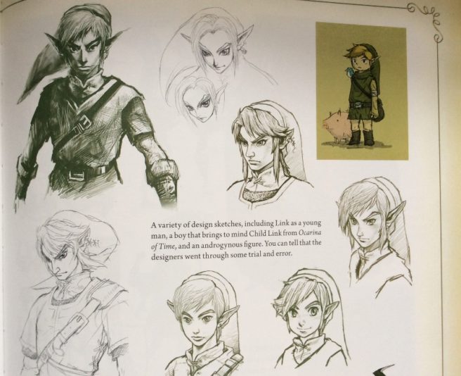
A few years ago, Nintendo and Dark Horse brought out The Legend of Zelda: Hyrule Historia. The book showed a bunch of concept art from the series, including Twilight Princess. There were many interesting designs depicted for characters such as Link. In some of the drawings, Link looked quite a bit older than his final version in the game. Now we have an idea about the potential age Nintendo was thinking about.
Nintendo artists Yusuke Nakano and Satoru Takizawa spoke about designing Link for Twilight Princess in the new Zelda: Art & Artifacts book. Nakano touched on how Nintendo considered making the character “twenty-five… maybe even thirty.” The intent was “making him quite sturdy”
Also worth mentioning, when designing Wolf Link, Takizawa noted how Nintendo thought about giving him a wolf cut hairstyle, “which would have given him a more wolfish look.”
Here’s the full transcript about Link’s design in Twilight Princess:
Artists on why Nintendo didn’t move forward with realistic Zelda on GameCube after Spaceworld tech demo
Posted on 8 years ago by Brian(@NE_Brian) in GameCube, General Nintendo, News | 47 Comments
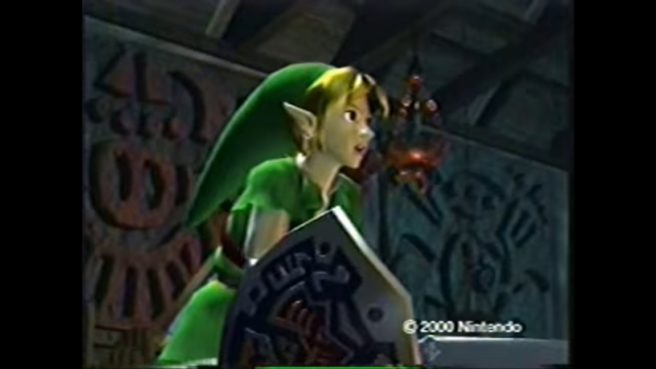
One of the more memorable moments in Zelda history was when Nintendo showed a GameCube tech demo at Spaceworld 2000. A brief scene depicted Link and Ganondorf duking it out in a realistic style. But as we later learned, it was just that – a tech demo and nothing more. Nintendo ended up going in a completely opposite direction for the next Zelda game following Ocarina of Time. Around two to three years later, Nintendo released the cartoon-esque, cel-shaded Wind Waker.
So what’s the story behind that tech demo anyway? And why did Nintendo decide against moving forward with it? In the new Zelda: Art & Artifacts book, artists Yoshiki Haruhana and Satoru Takizawa commented on the situation:
